Wednesday, 30 December 2015

New Year, New Trailhead Badges

Badges

Overview

The Trailhead juggernaut keeps rolling, with a new trail and 6 (count ‘em) new badges, taking the totals up to 13 trails and 70 badges (not counting the community badges which you get for earning a new badge on a particular date, such as halloween, which is always tricky for those of us who already have all the badges, but these are the first world problems I am cursed with).

So What’s New?

  • Advanced Formulas
    This strikes me as an excellent fit for Trailhead, as the challenges will be tightly focused on a single formula field which satisfies a well-defined set of requirements. I’d imagine there was some competition in the team that writes the code that checks the challenges for this one.
     
  • Apex Integration Services
    If you haven’t done much of this before, get cracking. Its a good grounding in the topic and gets you writing code that carries out real integrations, but in a much safer environment than a customer org! 
     
  • Lighting Experience Chatter Basics
    One aimed more at the newbies than the experienced administrator or developer, which is a good thing as we want new people using the platform.

  • Lightning Data Management
    Getting data in and out. Useful information if you are considering a career with a Salesforce partner, as I guarantee that any project you work on will have some form of data migration, and it always takes longer than you expect!

  • Application Lifecycle Management
    Okay, so this is a rewrite rather than a new module. If you’ve taken this in the past you won’t be able to retake it, but if you held off waiting for some different words your masterful inactivity has paid dividends.

    and saving the best until last
     
  •  Build a Battle Station App
    A themed project to coincide with a film that you might have heard about. This kind of thing is what makes Trailhead fun and keeps it interesting. This is one of the few badges that I have remembered to add to my LinkedIn profile, which shows how valuable it is

So What’s Next?

I wish I knew. Or maybe I do and those pesky NDAs stop me from telling you. Unfortunately I don’t. But is that what the NDA forces me to say. Its all so uncertain.

One prediction I will make is that the number of badges will break 100 in 2016, and I’d expect this to happen around July/August time.

New Year, New You

As I mentioned above, there are now 70 badges available, so if you haven’t made a dent in them by the start of 2016 you’ll struggle to catch up and be forever chasing those last x badges.

Make a New Year’s resolution that will have real impact (on your career, your reputation, your battle station building capabilities) and resolve to earn more badges!

Related Posts


Saturday, 12 December 2015

Lightning Component Wrapper Classes

Lightning Component Wrapper Classes

Wrapper

Introduction

Wrapper classes are a common feature of applications built on the Salesforce platform. The class wraps an sObject and some additional data, hence the name wrapper. Typically wrapper classes are used to temporarily associate prpoerties with an sObject that are specific to the current scenario, and that do not make sense to add as fields to the sObject and persist to the database.

In this post I’ll show how you can use wrapper classes in a Lightning component, to wrap an account and a boolean property. This wrapper class allows a user to select one or more account names to view more details of the accounts.


Showmecode

The Apex Controller

My Apex controller makes a couple of methods available to the Lightning component. The first is invoked when the component initialises, and returns a collection of up to 10 accounts, with only the name and Id fields populated:

@AuraEnabled
public static List<Account> GetAccountNames()
{
	return [select id, Name from Account limit 10];
}

 the second method receives a JSON string representing a list of account ids (the accounts that the user has selected) and retrieves more details for those accounts:

@AuraEnabled
public static List<Account> GetAccountDetails(String idListJSONStr)
{
	Type idArrType=Type.forName('List<Id>');
	List<Id> ids=(List<Id>) JSON.deserialize(idListJSONStr, idArrType);
		
	return [select id, Name, Industry, Website from Account where id in :ids];
}

 Ideally I’d pass the Ids through as an array to this method, but attempting to pass arrays as parameter to Apex controller methods from a Lightning component results in an internal server error. At the time of writing (December 2015) this has been acknowledged as a bug for over a year, so its clearly one that is taking a bit of fixing! For a collection of primitives, the JSON string version works well, but when I need to send an array of complex objects (or sObjects) I usually place these inside a containing Apex class.

The Wrapper Class

I want my wrapper class to be available for use in both my component and in Apex, so that I can use the same one for Lightning and Visualforce. As I’ve written about before, custom apex classes are automatically converted to JavaScript objects for use client side, so to achieve this all I have to do is make the class properties available to the Lightning component via the AuraEnabled annotation:

public with sharing class AccountWrapper
{
	@AuraEnabled
	public Account acc {get; set;}
	
	@AuraEnabled
	public Boolean selected {get; set;}
}

(If I didn’t need to make use of this server-side, I’d just use JavaScript objects, which would make this post considerably shorter!)

The Lightning Component

The Lightning component has two sections - the first displays a list of account names and checkboxes for the user to choose accounts, and the second to display details of the chosen accounts:

<aura:component controller="AccountController">
    <aura:handler name="init" value="{!this}" action="{!c.doInit}" />
    <aura:attribute name="wrappers" type="AccountWrapper" />
    <aura:attribute name="accounts" type="Account" />
    <span class="big">Choose Accounts</span>
    <table>
        <tr>
            <th class="head">Name</th>
            <th class="head">View?</th>
        </tr>
	<aura:iteration items="{!v.wrappers}" var="wrap">
            <tr>
                <td class="cell">
		    <ui:outputText value="{!wrap.acc.Name}" />
                </td>
                <td class="cell">
		    <ui:inputCheckbox value="{!wrap.selected}" />
                </td>
            </tr>
	</aura:iteration>
    </table>
    <button onclick="{!c.getAccounts}">Get Accounts</button>
    <br/>
    <br/>
    <br/>
    <span class="big">Selected Accounts</span>
    <table>
        <tr>
            <th class="head">Name</th>
            <th class="head">Industry</th>
            <th class="head">Website</th>
        </tr>
        <aura:iteration items="{!v.accounts}" var="acc">
            <tr>
                <td class="cell">
	    	    <ui:outputText value="{!acc.Name}" />
                </td>
                <td class="cell">
	    	    <ui:outputText value="{!acc.Industry}" />
                </td>
                <td class="cell">
	    	    <ui:outputText value="{!acc.Website}" />
                </td>
            </tr>
	</aura:iteration>
    </table>
</aura:component>

Note that the AccountWrapper custom class is defined as the type of the wrappers attribute that is used to display the accounts and their checkboxes. This allows me to supply the wrapper classes from the server in the future if for some reason I decide to go that route.

The Lightning Component JavaScript

The controller for the Lightning component contains a couple of methods that delegate to the helper and isn’t that exciting. For those that need the complete picture, its available at this gist.

The helper is much more interesting, but a bit large to drop into this post. It can be found at this gist, but the key aspects are covered below.

The wrapper class instances are created client side, which is really easy in JavaScript, mainly due to its loose typing. I can just define an object instance that contains an account and a selected property. In the snippet below, accs is the collection of accounts returned from the controller at initialisation:

var wrappers=new Array();
for (var idx=0; idx<accs.length; idx++) {
    var wrapper = { 'acc' : accs[idx],
			       'selected' : false
                            };
     wrappers.push(wrapper);
}
cmp.set('v.wrappers', wrappers);

Once the user selects the accounts and presses the getAccounts button, I can iterate the list of wrapper classes and pull the ids of the selected items, which I then turn into the JSON string: 

var wrappers=cmp.get('v.wrappers');
var ids=new Array();
for (var idx=0; idx<wrappers.length; idx++) {
    if (wrappers[idx].selected) {
        ids.push(wrappers[idx].acc.Id);
    }
}
var idListJSON=JSON.stringify(ids);

The Lightning Component Styling

In order to make the page a bit more readable, there’s some styling around the component. This is also not particularly interesting but can be found at this gist.

The Application

In order to use this component, I’ve created a simple Lightning application:

<aura:application >
    <c:AccountWrappers />
</aura:application>

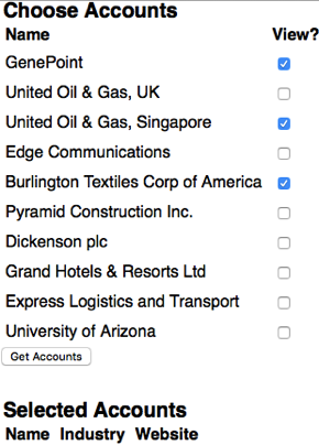
Opening the application displays the first 10 accounts retrieved from the database, which I can check the associated box to select:

Screen Shot 2015 12 12 at 16 55 05

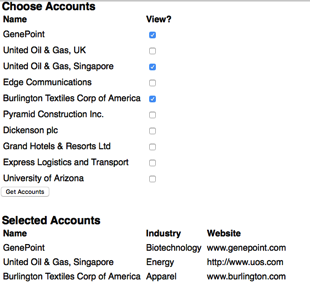
and clicking the Get Accounts button retrieves details of those accounts and displays them:

Screen Shot 2015 12 12 at 16 56 07

Related Posts


Saturday, 28 November 2015

Context is Everything

Context is Everything

Context title

You Are in a Maze of Twisty Passages, All Alike

When building applications around Lightning components on the Salesforce platform, there comes a time when you need to know where you are - in Salesforce1 or the Lightning Experience for example. Winter 16 upped the ante by allowing Lightning components to be embedded in Visualforce pages. I was expecting there to be a mechanism to get at this information via the Lightning component framework, but unfortunately that turned out not to be the case, so I had to spend some time investigating.

Desperately Seeking Context

My problem was how to figure out from inside a Lightning component whether I was executing in:

  • Salesforce1
  • Lightning Experience (LightingX)
  • Visualforce inside Salesforce1/LightningX
  • Visualforce in Salesforce Classic

Lightning Detector

Looking through the docs, there are a couple of events that are only available to components executing in Salesforce1/LightingX:

  • force:showToast
    This displays a message in a popup (or really a popdown, as it appears under the header at the top of the view)
  • force:navigateToURL
    This allows navigation to a URL from a lightning component

The docs state that it these methods are only available in Salesforce1, but as far as I’ve been able to tell, LightningX is pretty much Salesforce1 for the desktop. 

In my JavaScript controller or helper, I can attempt to instantiate the event and based on the success or failure, deduce whether I am in the Lightning context: 

isLightning: function() {
    return $A.get("e.force:showToast");
}

Mobilize

The availability of the above events tells my component if it is executing in Lightning, but not which of Salesforce1 / LightningX is the container. The only way I’ve found to reliably detect this is to use the blunt instrument that is the user agent, 

I’ve tested on an iPhone, iPad and Android phone, both for the HTML5 and installed application versions of Salesforce1, and the user agent string always contains the word ‘mobile’. However, when I am running LightningX on the desktop, this is not the case.

Note that this is by no means exhaustive testing, so if you are considering using this technique make sure to verify this behaviour on your target devices.

The controller/helper can detect mobile based on the presence or absence of mobile in the user agent as follows: 

isMobile: function() {
    var userAgent=window.navigator.userAgent.toLowerCase();
    return (-1!=userAgent.indexOf('mobile'));
}

Visualforce

I’ve found that this scenario causes the most confusion, as the assumption is that as code from a lightning component is executing, the context must somehow switch to Lightning while that is happening. A better way to think about this is in terms of the container. In Salesforce1 and LightningX, the containing application is built with Lightning components, whereas when a Lightning component is embedded in a Visualforce page, the page is the container.

The ability to detect if a Visualforce page is embedded in a Salesforce1 application has been around for a while now, and it is equally applicable to LightningX - check if the sforce and sforce.one objects are present. I can detect this in my controller/helper as follows:

hasSforceOne : function() {
    var sf;
    try {
        sf=(sforce && sforce.one);
    }
    catch (exc) {
        sf=false;
    }
     
    return sf;
}

Putting it all Together

Going back to my list of scenarios, from my lightning component I can detect each of these using the functions defined earlier  as follows:

  • Salesforce1

        isLightning() && isMobile()
     
  • Lightning Experience (LightingX)

        isLightning() && (!isMobile())
     
  • Visualforce inside Salesforce1/LightningX

        (!isLightning()) && hasSforceOne()
     
  • Visualforce in Salesforce Classic

        (!isLightning()) && (!hasSforceOne())

The Future

While these mechanisms are the best I’ve been able to do with the available tools, Salesforce will probably add something to the Lightning component framework that makes them redundant. When this happens, if you’ve kept the functionality in the methods I’ve shared above, you can simply update these to delegate to the framework rather than figuring it out for themselves. 

Related Posts


Saturday, 14 November 2015

Trailhead in the Wild

Trailhead in the Wild

Screen Shot 2015 11 14 at 16 54 32

Available, generally 

Trailhead is out of beta and generally available, so if you’ve been holding back in case it disappeared (pretty unlikely given the dev zone at DF15 was built around it) you can now jump in with both feet. It also has an updated UI, which feels a lot faster to me, even on what passes for an internet connection to my home!

Find what you need faster

Its now easier to find the right content for you - after clicking on the ‘Learn Trailhead for Free’ button, you are presented with a popup dialog where you choose between Admin, Developer or Business User:

Screen Shot 2015 11 14 at 16 51 51

of course the correct approach to Trailhead is to take everything, so this is really more a case of deciding the order in which you want to cover things!

Trailhead has also been incorporated into the search functionality, so if, for example, you search for ‘Lightning’ you’ll get details of the 30 trails with Lightning content - perfect if you are looking to learn about a specific feature of Salesforce.

Look mother, I’m dancing!

Its now even easier to seek and get the attention you deserve for your Trailhead accomplishments.

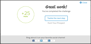
After passing a step you get some nicely styled flattery and the option to share this milestone with your social media followers.

Screen Shot 2015 11 13 at 21 18 17

Gain a badge and the ante is upped considerably - not only can you ram this down the throat of the badge-poor on social media:

Screen Shot 2015 11 13 at 21 25 57

but you can also post this to your LinkedIn profile and thus receive further connection requests and messages from recruiters desperate for Salesforce candidates:

Screen Shot 2015 11 13 at 21 27 10

Here’s my latest badge on my LinkedIn profile (Look, there’s my Technical Architect cert, how did that get in there? Oh well, best leave it in for now!).

Screen Shot 2015 11 13 at 21 28 46

At the moment it looks like you can only add new badges to LinkedIn, something that LinkedIn are probably okay with, given that they’d be looking at the flood of over 250,000 badges that have been earned to date!

All I want for Christmas

So what does the future hold for Trailhead? Even if I knew, one of the many NDAs that I’ve signed over the years would no doubt preclude me from talking about it. What’s the first rule of the future of Trailhead?

Given how successful and high profile Trailhead has been to date, I think it's safe to assume we’ll continue to see the content expanded and the experience improved. Here’s a few things that I’d really like to see, and be assured that I have given no thought to how expensive or difficult they might be to achieve:

  • Private trails
    I’d imagine that pretty much every Salesforce customer and partner would find this useful - the ability to create trails around your own custom processes and applications, along with exercises, verification and badges would be a great benefit when on-boarding new staff.
  • Groups of users
    Obviously I’d use this to pit my colleagues against each other to see who could upskill on a particular area the fastest. I think I’d have a lot of fun with this.
  • API Access to Trailhead Profiles
    I’d use this to build a leaderboard for my company, to shame the badge-poor give new hires something to aim for. Then I’d probably use it for evil, so oauth would be a good authorisation mechanism as users could easily revoke my access.
  • Fantasy Trailhead
    Team Managers would pick teams of community users and get points as they gained Trailhead badges. Maybe they would lose points if their team didn’t gain badges quickly enough. Gamification squared if you will. It would also open up Fantasy Fantasy Trailhead, where you would pick teams of Team Managers, and so on, for ever.

Still free, as in beer

Shutup

Nothing down and nothing a month.

Saving the best until last

When you open the Trailhead home page and scroll down, you’ll see my face over the Developer Trails link, and I think we can all agree it doesn’t get any better than that.

Related Posts


Sunday, 1 November 2015

Reading QR Codes in Salesforce1 Revisited

Reading QR Codes in Salesforce1 Revisited

Overview

Back in 2014 I wrote a blot post around reading QR codes in the Salesforce1 application to automatically navigate to a record. At the time, Salesforce1 did not have a custom URL scheme to allow it to be easily opened from an external application. That all changed at the beginning of 2015 with the launch of the Salesforce1 Mobile URL Schemes.

With a custom URL scheme, there’s no longer any need to process a picture of the QR code in the Salesforce1 application. This improves the user experience for a couple of reasons:

  • The original process of take a picture, see if it looks good enough and then try to process it can be time consuming. 
  • Even with what appears to be a good picture, I’ve always found the processing to be quite slow and rather hit and miss.

A dedicated QR scanner application is much less picky about the picture quality and typically processes the code in under a second, so this seems to be the obvious way to go.

Scanners and Custom URL Schemes - Will They Ever Get Along?

Unfortunately, many scanner applications don’t handle custom URL schemes and when they see a URL that doesn’t start with http/https, throw an error.  One way to work around this is to use a URL shortener - TinyURL, for example will convert a URL with a custom scheme to one with an http scheme. This isn’t a great solution though, as I’d need to integrate with the URL shortener when generating my QR code and it introduces an additional HTTP request to the shortening service. When you are working in mobile world, the last thing that you want is to introduce additional requests!

Luckily, some scanner applications do support custom URL schemes - I used Scan when preparing this post.

Generating a QR Code

There are a few ways to generate a QR code. In the past I’ve used the Google Infographics service, but that has been deprecated for over three and a half years now so is highly likely to stop working. The most popular replacement for this is GoQR.me, which works in much the same way, generating a QR code via an HTML image element. 

The URL that the code represents needs to follow the Salesforce1 custom URL scheme to navigate to a record’s view page:

salesforce1://sObject/<id>/view

I’ve created a simple Visualforce page to generate the QR code for an Account record.

<apex:page standardController="Account">
  <apex:pageBlock title="QR Code">
    <p style="padding-bottom: 10px">
       Scan the code below on your mobile device to open the account record in Salesforce1
    </p>
    <apex:image
          value="https://api.qrserver.com/v1/create-qr-code/?size=150x150&data={!URLENCODE('salesforce1://sObject/' + Account.Id + '/view')}" />
  </apex:pageBlock>
</apex:page>

 Navigating to this page with the ID of an existing account renders the following page:

Screen Shot 2015 11 01 at 08 08 22

Scanning the Code

Scanning this with a QR code scanner application that supports custom URL schemes navigates to the record view, as shown the video below. Note that I need to be logged into the organisation that the record belongs to in order to view it.

This video shows how much better using a dedicated scanner app is versus taking a picture and processing it - as long as I’m pointing the camera in the direction of the QR code, the app barely has time to start up before it has locked onto the code and is processing it.

Related Posts


Saturday, 24 October 2015

LDS Activity Timeline, Lightning Components and Visualforce

LDS Activity Timeline, Lightning Components and Visualforce

Overview

One of the aspects of the Lightning Design System (LDS) that I particularly like is the example components, which means that I don't have to find a standard page with the feature that I want and scrape the HTML to replicate it.

A useful component for a variety of purposes is the Activity Timeline, which provides a visual overview of what has happened to a record, customer, anything you can think of really, and when. This is in use in a number of places in the new Lightning Experience UI to show activities, both future and historic.

In this post I'll show how to create an activity timeline component that displays the opportunities that have been closed won for a particular account record. I'll also be using the new Winter 16 feature that allows Lightning Components to be embedded inside a Visualforce page, which saves me having to write boilerplate JavaScript to pull the account Id parameter from the URL.

Remember that Winter 16 requires My Domain before Lightning Components can be displayed.

Update 31/10/2015 - @JennyJBennett pointed me at the Winter 16 release notes, which say:

— snip ---

Finally, you don’t need to enable My Domain to use Lightning components in the following contexts.

  • Lightning components with Communities in Community Builder
  • Lightning Components for Visualforce

— snip ---

Which means that you don’t need to enable My Domain to use the code in this blog post (though you will if you want to use the other components in my unmanaged package). This makes perfect sense as this is a security requirement, and Visualforce is already blocked from taking over other parts of the page/app via the browser’s same origin policy.

Show me the Code!

I didn't want to create a timeline that was tightly coupled to the opportunity sObject, instead I was looking for a more generic solution that could display any kind of data. I also didn't want the component to have to know too much about the information that it was displaying - components are much more re-usable if they just traverse a data structure and output what they find.

To this end, the timeline is modelled as a single Apex class, BBTimeline, with an inner class to represent an entry in the timeline. Note that the class fields are all annotated @AuraEnabled, to make them available for use the lightning component that renders them:

public class BB_LTG_Timeline {

    @AuraEnabled
    public String name {get; set;}
        
    @AuraEnabled
    public List<Entry> entries {get; set;}
        
    public BB_LTG_Timeline()
    {
        entries=new List<Entry>();
    }

    public class Entry
    {
        @AuraEnabled
        public Date theDate {get; set;}

        @AuraEnabled
        public String description {get; set;}
    }

}

There's then a custom Apex controller that builds the timeline object, in this case by retrieving the closed won opportunities from the database. It’s the responsibility of the method constructing the Timeline to add the entries in the desired order:

public class BB_LTG_AccountOppTimelineCtrl
{
    @AuraEnabled
    public static BB_LTG_Timeline GetTimeline(String accIdStr)
    {
        BB_LTG_Timeline result=new BB_LTG_Timeline();
        try
        {
            Id accId=(Id) accIdStr;
            System.debug('Account id = ' + accId);
            Account acc=[select id, Name from Account where id=:accId];
            result.name=acc.Name + ' closed deals';
            List<Opportunity> opps=[select CloseDate, Amount, Type
                                    from Opportunity
                                    where AccountId=:accId
                                      and StageName='Closed Won'
                                    order by CloseDate desc];

            for (Opportunity opp : opps)
            {
                BB_LTG_Timeline.Entry entry=new BB_LTG_Timeline.Entry();
                entry.theDate=opp.CloseDate;
                entry.description=opp.type + ' opportunity closed for ' + opp.amount;
                result.entries.add(entry);
            }
        }
        catch (Exception e)
        {
           System.debug('Exception - ' + e);
        }
        
        return result;
    }
}

Next there's the lightning component that outputs the timeline - BBAccountOppTimeline. This is pretty much lifted from the example in the Lightning Design System documentation. 

<aura:component controller="BB_LTG_AccountOppTimelineCtrl">
    <aura:attribute name="recordId" type="String" />
    <aura:attribute name="timeline" type="BB_LTG_Timeline" />
    
    <ltng:require styles="/resource/BB_SLDS091/assets/styles/salesforce-lightning-design-system-ltng.css"
    afterScriptsLoaded="{!c.doInit}" />
    
    <div class="slds">
        <c:BBAccountOppTimelineHeader />
        <ul class="slds-timeline">
            <p class="slds-m-around--medium"><a href="#">{!v.timeline.name}</a></p>
            <aura:iteration items="{!v.timeline.entries}" var="entry">
                <li class="slds-timeline__item">
                    <span class="slds-assistive-text">Event</span>
                    <div class="slds-media slds-media--reverse">
                        <div class="slds-media__figure">
                            <div class="slds-timeline__actions">
                                <button class="slds-button slds-button--icon-border-filled">
                                    <c:BBsvg class="slds-icon slds-icon-standard-event slds-timeline__icon" xlinkHref="/resource/BB_SLDS091/assets/icons/standard-sprite/svg/symbols.svg#event" />
                                    <span class="slds-assistive-text">Opportunity</span>
                                </button>
                                <p class="slds-timeline__date"><ui:outputDate value="{!entry.theDate}" /></p>
                            </div>
                        </div>
                        <div class="slds-media__body">
                            <div class="slds-media slds-media--timeline slds-timeline__media--event">
                                <div class="slds-media__figure">
                                    <c:BBsvg class="slds-icon slds-icon-standard-opportunity slds-timeline__icon" xlinkHref="/resource/BB_SLDS091/assets/icons/standard-sprite/svg/symbols.svg#opportunity" />
                                </div>
                                <div class="slds-media__body">
                                    <ul class="slds-list--vertical slds-text-body--small">
                                        <li class="slds-list__item slds-m-right--large">
                                            <dl class="slds-dl--inline">
                                                <dt class="slds-dl--inline__label">Description:</dt>
                                                <dd class="slds-dl--inline__detail"><a href="#">{!entry.description}</a></dd>
                                            </dl>
                                        </li>
                                    </ul>
                                </div>
                            </div>
                        </div>
                    </div>
                </li>
            </aura:iteration>
        </ul>
    </div>
</aura:component>

The JavaScript controller and helper, plus the supporting BBTimelineHeader component can be found in the unmanaged package or github repository via the links at the end of this post.

In order to display a Lightning Component in a Visualforce page, you need to construct a simple Lightning Application that is used as the bridge between the two technologies. This needs to have a dependency on the Lightning Component that will display the content - BBAccountOppTimeline in this case: 

<aura:application access="GLOBAL" extends="ltng:outApp">
    <aura:dependency resource="c:BBAccountOppTimeline" />
</aura:application>

Once the app is in place, there's a small amount of markup in the Visualforce page to tie things together - note that the Lightning Component is constructed dynamically via JavaScript, rather than being included in the page markup server side:

<apex:page sidebar="false" showHeader="false" standardStylesheets="false">
    <apex:includeScript value="/lightning/lightning.out.js" />
    <div id="lightning"/>

    <script>
        $Lightning.use("c:BBAccountOppTimelineApp", function() {
            $Lightning.createComponent("c:BBAccountOppTimeline",
                  { "recordId" : "{!$CurrentPage.parameters.id}" },
                  "lightning",
                  function(cmp) {
                    // any further setup goes here
              });
        });
    </script>
</apex:page>

The Results

Once all this scaffolding is in place, accessing the Visualforce page with the id of an account with at least one closed won opportunity displays a timeline of these opportunities, with the most recent at the top:

Screen Shot 2015 10 24 at 12 14 46


Where Can I Get It

As usual, I've added this into my BBLDS samples project available on github at :

https://github.com/keirbowden/BBLDS

Are there Test Classes?

Yes - this is available as an unmanaged package (there’s a link in the Github README), and you have to have test coverage to upload a package. Caveat emptor - these are purely focused on coverage!

Related Posts


Saturday, 10 October 2015

Responsive Design with the Lightning Design System

Responsive Design with the Lightning Design System

Screen Shot 2015 10 10 at 17 44 36

Introduction

The Lightning Design System was launched by Salesforce in August 2015 and, as I previously blogged, is the first time that Salesforce have made styles available to the developer community that allow us to build pages that match the standard look and feel perfectly (the standard look and feel for the Lightning Experience that is, Salesforce classic would still require style scraping).

The Lightning Design System offers more than just styling - it also provides a Responsive Grid to allow building of user interfaces that react to the device being used, to provide an appropriate experience tailored to the amount of screen real estate available.

Responsive Design

Overview

Wikipedia has a great definition of Responsive Design:

"Provide an optimal viewing experience – easy reading and navigation with a minimum of resizing, panning and scrolling – across a wide range of devices”.

From a technical perspective its a mechanism for building web pages so that they respond to the device that is displaying them. The page changes its content and layout based on the viewport size and orientation of the device. Ethan Marcotte first coined the phrase in his article on A List Apart, which is well worth a read.

An important point about responsive design is that its not about removing content for smaller devices - more and more of the web is accessed via mobile devices these days and you don’t want to punish people for accessing your content via a phone by only serving them part of what you have to offer.

Responsive Grid

A responsive grid breaks your page up into a collection of rows, each of which decomposes into a common number of columns. On a large device the row will contain all columns, while on an extra-small device such as a phone, the grid can reflow to display one column per row, stacking the columns vertically instead of laying them out horizontally.

This is achieved via CSS media queries - a media query is essentially CSS that limits its scope based on attributes of the device. For example, consider the following media query:

.sidebar {
    display: none;
}

@media (min-width: 1024px)  {
    .sidebar {
         display: block;
    }
}

 the initial CSS rule mandates that anything with a class of sidebar will be hidden by setting the display attribute to none. The next rule is constrained by a media query and only applies if the minimum width of the device is 1024 pixels. This rule overrides the sidebar style to make it visible by setting the display attribute to block. Thus any user accessing the page on a small device will not see content with the sidebar class, while those accessing from a large device will.

Note that in keeping with the principle that responsive design is not about removing content, if i were using this media query on a real page I would still allow users accessing from a mobile device to see the content, just not as part of a sidebar.

Responsive Images

Displaying the right images for a device form factor is an important part of responsive design, and I’ve written about this before in the following blog post

Lightning Design System

The Lightning Design System responsive grid is created by specifying a component with the style class slds-grid - I pretty much always use a div as that way I don’t get any additional behaviour outside of the container. Note that you also want to specify the style class slds-wrap, otherwise your grid will continue to layout columns horizontally and, if you are anything like me, you’ll waste a couple of hours digging through the HTML and CSS trying to figure out what is going on.

Inside the grid, elements with the style class slds-col define the column data. Additional style classes can be applied to dictate how the columns will flow based on the device size. For example, given the following layout for extra small and large devices:

Screen Shot 2015 09 28 at 09 16 59

In this scenario, on a small device I want each component to span the full width of the device, while on a large device I want the search/about component to appear in a smaller sidebar on the right hand side.

Using the responsive grid, I can keep the same content, but define different column spans based on the device itself. 

<div class="slds-grid slds-wrap">
    <div class="slds-col slds-size--1-of-1 slds-medium-size--3-of-4">
        ...
    </div>
    <div class="slds-col slds-size--1-of-1 slds-medium-size--1-of-4">
        ...
    </div>
</div>

As the grid styles are mobile first, whatever I specify as the default (slds-size—1-of-1) will apply from extra small upwards. My override for medium (slds-slds-medium-size—3-of-4) will apply to that device size and upwards, so covering medium and large devices.

Blog Posts App

Overview

The sample blog post application conforms to the layout shown above - the main content of the page is a list of blog posts and for medium and large devices, their associated comments. There are additional elements to allow searching for posts containing matching text and about me content. On medium and large devices the additional elements are displayed to the right of the posts, while for extra small and small devices they are stacked under the main content. The Picturefill plugin displays different images for large, medium and small or less devices.

Here’s a screen shot for a large device:

Screen Shot 2015 10 04 at 13 36 54


a medium device (the only difference is the image):

Screen Shot 2015 10 04 at 13 37 19


and finally a small device - the difference here is the image, hidden comments and the right hand content stacked under the blog post body:
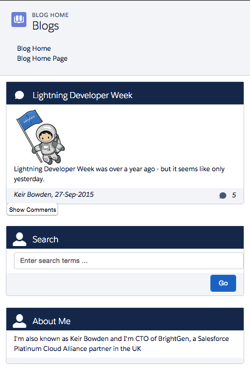
Screen Shot 2015 10 04 at 13 37 41

In order to view the sample you’ll need to deploy the code or install the managed package, as I haven’t yet found a way to make lightning components available via a Force.com site. I have hopes that the new lightning components in Visualforce functionality in the Winter 16 release will be the solution to this, but I haven’t had time to play with this in a site context.

This sample was originally written for a Dreamforce talk using Visualforce and Twitter Bootstrap - you can find out more about this in my developerforce blog post.

Gotchas

One thing that I’ve been struggling with and been unable to find a solution to, is conditionally hiding some content for multiple device sizes. When my blog posts are displayed on extra small or small devices, I want to hide the comments and provide a button to allow the user to display them. In something like Bootstrap I’d specify the button container with the classes hidden-md and hidden-lg. LDS doesn’t have an equivalent of this, so I’ve ended up using a span with a single LDS class - slds-x-small-show (which due to mobile-first means hidden for everything) and then adding another container inside this to hide the content for medium devices:

<span class="slds-x-small-show">
    <div class="medium-hide">
        ... button markup here ...
    </div>
</span>

The medium-hide style is as follows: 

/* hide medium and above */
@media all and (min-width: 768px) {
	.THIS .medium-hide {
        display:none;
	}
}


Responsive images also proved a challenge. I use the Picturefill polypill as the HTML5 picture element support is still lacking on some browsers. The latest version of this makes use of the Picture element but the developer console won’t let me save the a component with that markup. For now I’m sticking with version 1 of Picturefill which uses spans. I might take another look at this in the future, as I should be able to add the picture element via JavaScript as part of the initialisation.

When I started writing the code for this blog post, the version of the Lightning Design System was 0.9.1. As I already had a sample using 0.8 I left that alone so there are two static resources in the repository/unmanaged package. LDS is now on 0.9.2 and may well be higher by the time I finish writing the post!

My Domain Required in Winter 16

Don’t forget that the Winter 16 release requires my domain to be set up in order to use Lightning Components.

Code Repository

The code for this sample is available in my Lighting Design System Samples github repository at : 

https://github.com/keirbowden/BBLDS.

There’s also an unmanaged package that you can install to get all of the samples, through be aware that if you do this then the next time I produce a sample you’ll have to uninstall the managed package which will lose any blog data you’ve created.

Related Posts