Showing posts with label lightning design system. Show all posts

Saturday, 11 May 2024

Formatted Output from Copilot Custom Actions


Image generated by DALL-E 3 based on a prompt from Bob Buzzard

Introduction

If you've seen any of the demos of Einstein Copilot, you'll notice that sometimes the responses are nicely formatted using the Lightning Design System, while other times they are simply text on a darker background - e.g. from the TrailblazerDX keynote, the pipeline information is text:


While the contacts are shown as a formatted list, with fields specific to the solution:


This isn't particularly well documented, so it's a matter of trial and error to figure out what works and what doesn't.

Text Responses

Text responses came out the same regardless of what I tried - the text that I return appears on a dark background. If I format it as JSON or CSV, it comes out in JSON or CSV format, even if I included instructions to display as a list of label/value pairs. 

The same goes for HTML markup - it's taken as text and shown to the user. Using \n for a line break works, but aside from that what you return from your custom action is what you see on the screen.

Custom Class

Returning custom class instances introduce a little more formatting. You can only return a single "value" from your custom action, but this can contain a list of custom class instances and Copilot will render each of the properties in it's own "text box". In the example below I return a single instance of my custom class Output, but this contains a list of instances another custom class. These in turn which contain the fields from Task records (as using the Tasks directly throws errors) :

public class Output
{
    @InvocableVariable
    public List<CustomRec> recs;
}

public class CustomRec
{
    @InvocableVariable
    public String ident;
        
    @InvocableVariable
    public String subject;
        
    @InvocableVariable
    public String description;
        
    @InvocableVariable
    public String activityDate;

    public CustomRec(Task task)
    {
        this.ident=(null!=task.id?'ID : ' + task.Id:null);
        this.subject=(null!=task.Subject?'Subject: ' + task.Subject:null);
        this.description=(null!=task.Description?'Description :\n' + task.Description:null);
        this.activityDate=(null!=task.activityDate?'Due Date : ' + task.activityDate:null);
    }
}

Copilot displays the properties from each record, although there isn't any separation between records. There's also a wrinkle in there I wasn't expecting - the properties are displayed in alphabetical order : activityDate, description, ident, subject. While unexpected, this does give me a way to order the properties if I need to:


sObject Records

As before, I can only return a single item from a custom action, so if I want to send back a list of records I have to wrap them in an containing class:

public class Output
{
    @InvocableVariable
    public List<Opportunity> opportunities;

    public Output()
    {
        opportunities=new List<Opportunity>();
    }
}

And this comes out very nicely, with a card for each record:


sObject Records and more!

This is the one that I'm most pleased about - it allows me to display records and some commentary about each record, while still retaining the Lightning Design System formatting for the record itself.

Once again I'm returning a custom class containing a list of other custom classes, but this time it's a wrapper class containing an sObject record and some additional information:

public class Output
{
    @InvocableVariable
    public List<OpportunityWrapper> opportunities;

    public Output()
    {
        opportunities=new List<OpportunityWrapper>();
    }
}

public class OpportunityWrapper
{
    @InvocableVariable
    public Opportunity opp;

    @InvocableVariable
    public String message;

    @InvocableVariable
    public String trailer;
        
    @InvocableVariable
    public String zzzSeparator='-----------------------------';

    public OpportunityWrapper(Opportunity opp, String message, String trailer)
    {
        this.opp=opp;
        this.message=message;
        this.trailer=trailer;
    }
}

I really didn't expect this to work, but it did!


I've taken advantage of the fact that the properties are displayed in alphabetical order to display a message about how near the close date is, then the record, then some commission information, followed by a rather ugly separator. I think if I was going to use this in production I'd have all the message above or below the record so that I didn't have to put a clunky separator in, but I wanted to see if I above and below would work.

Conclusion

I don't think this is too bad, given that Copilot is at its heart a text based tool. Hopefully in time we'll be able to apply more formatting to text output, but at least sObject records are styled for the Lightning Experience. Worst case, we all end up polluting our Salesforce org with a bunch of fake records that are just used as carriers for Copilot responses! 

Related Posts


Saturday, 31 March 2018

Building My Own Learning System - Part 6

Building My Own Learning System - Part 6

Versions

Introduction

In previous posts in this series I covered the initial idea and development through to sharing the code with installation, configuration etc instructions. Now that I have the basics working I’ve started to iterate and add a few features. Oddly the first feature I added was the one that I most recently thought of - the ability to display a custom message to the user when they complete a path, retrieved from the path itself. I’m thinking that this will allow me to carry use the system for more interesting challenges - complete a path to get a keyword, or a location, something like that anyway,. I did say I’d just thought of it, not that I’d thought it through!  It was only a few lines of code to implement this, just a change to the PassStep method so that it returned a tuple of a completed state and message to display, A few tweaks to the unit tests and I carried out an sfdx deployment to my sample endpoint and verified with my updated client code that all was working as expected and my sample Bob Buzzard character path was displaying the custom message:

Screen Shot 2018 03 31 at 16 14 48

Then it hit me - anyone that didn’t have my new client would get errors when accessing the sample endpoint, and they’d have to dig into the debug logs to figure out why. Suddenly it was important to add another feature. (Looking at my sample endpoint it appears that there’s only me using it at the moment anyway, so I guess if you are going to break things then the earlier the better!).

Versioning

Like most things in the tech world, there are loads of different ways to handle versioning. I considered the Salesforce route of having different endpoints for each version and discounted it. I’m not convinced that I want to be supporting older versions and I don’t particularly want to get into managing a number of classes representing historic versions. Salesforce can do this because they have more than one person maintaining things in their downtime, and if I ever become a multi-billion dollar company I’ll reconsider.

The route I ended up going was defining the version for each of the client and server in code, and having the client send its version with every request to an endpoint. The endpoint then compares this to its version and decides if it can handle the request. This gives me the option of supporting older versions if I want to, without committing me to any level of service! If the endpoint can't handle the request it throws an exception indicating what needs to happen - either upgrade the client or ask the admin of the endpoint to upgrade that. The updated client displays the error message to the user who can jump on any required action.

Installing the Latest ... Version

The current version of the system is now V1.0, and I’ve created github releases for both the endpoint and client, both of which have been tagged as V1.0. 

The unmanaged package the client V1.0 release is : <Salesforce instance>/packaging/installPackage.apexp?p0=04t0O000001IqIm

Related Information

As I plan to continue with these posts as I add new features or learn that I’ve made a terrible mistake should have done things differently, I’ve moved the list of posts into a dedicated page on this blog. 


Sunday, 4 February 2018

Building My Own Learning System - Part 2

Building My Own Learning System - Part 2

Introduction

In Part 1 of this blog series I covered the problem I was trying to solve (on-boarding/accrediting internal and external users with the same content, but without opening up all my content to everyone) and the data model to support this.I also mentioned that this isn’t an attempt to rebuild Trailhead, and that is still the case.

In this post I’ll cover the user interface and the elements of the solution that allowed me to test it without having the build out the entire backend.

The “Design"

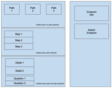
The first thing I did was to sketch out what I wanted a couple of the components to look like. The original sketches are below, and I think we can all agree that this communicates the entire concept of the look and feel I’m trying to achieve ;)

Screen Shot 2018 02 04 at 07 35 23 png

It did help me to think about how I wanted things to work though.

Single Page Application

I wanted a single page application (SPA) as I wasn’t going to have the sobjects in the same instance as the client, so lightning navigation between sobjects wasn’t an option. This does present a challenge with regard to bookmarking, but that is something I think I can do by making the SPA support URL parameters. The user might have to jump through a couple of extra hoops, but nothing too arduous, so I felt happy kicking that down the road to a later release.

The SPA consists of a central section and right hand sidebar,  The sidebar contains details of the current content endpoint and allows switching of endpoints, while the central section contains the actual learning content. The page is constructed from a number of lightning components and styled using the SLDS, as I want people to use it from inside Salesforce so it’s important that the styling is familiar.

Screen Shot 2018 02 04 at 08 04 50 png

Fake News

When I’m building an application of this nature, I’ll usually create a fake data provider so that I can get the UI flow without having to put a lot of effort into writing the actual server side implementation. Usually this is because I’m building it out in my spare time and it allows me to get something to throw stones at in place quickly.  As I’m looking at a distributed system in this case, it was even more useful as I didn’t have to create remote content endpoints and manage the integration with them. Instead I created the initial cut of the Apex interface that I want an endpoint to support and then wrote a faker implementation class that would return indicative but hardcoded responses.  This approach has the added benefit of allowing me to iterate on the interface without having to update multiple implementations of it.

Training Page

My training page is a lightning page with the training SPA added to it. Notice that I didn’t create a header aspect for my SPA - this is because a lightning page automatically adds a header that I can’t customise. The page thus has the lightning experience global header and the standard page header, so if I add a third one then most of the visible area is consumed. 

The SPA initially displays the available training paths from the fake service, laid out as a wrapping grid that shows 3 paths per row for the desktop and 1 per row on mobile:

Screen Shot 2018 02 04 at 08 39 08 png

Clicking on any of the paths shows the underlying steps that I need to complete:

Screen Shot 2018 02 04 at 08 39 20 png

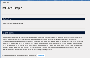
and clicking into a step takes me to the actual content with any questions that have been defined, although for the demo step I’ve chosen here the fake service pretends I’ve completed it:

Screen Shot 2018 02 04 at 08 39 42 png


And that wraps up this post. In the next instalment I’ll cover the integration with a remote endpoint.

Related Posts


Monday, 20 November 2017

Animated Lightning Progress Bar

Animated Lightning Progress Bar

Introduction

The Salesforce Lightning Design System has a progress bar component, which can be used to communicate how far through a process the user is, or how close to achieving their target audience they are in BrightMedia. Typically this will be wired up to an attribute so that it updates automatically when the attribute value changes, for example:

<aura:application extends="force:slds" >
    <aura:attribute name="value" type="Integer" default="25" />
    <div class="slds-m-around_small">
        <div class="slds-text-heading_large slds-m-bottom_small">Progress Bar Demo</div>
        <div class="slds-m-bottom_large">
            <label>Enter value : <ui:inputNumber value="{!v.value}"/></label>
        </div>
        <div>
            <div style="width:25%" class="slds-progress-bar slds-progress-bar_circular slds-progress-bar_large"
                    aria-valuemin="0" aria-valuemax="100" aria-valuenow="{!v.value}" role="progressbar">
                <span class="slds-progress-bar__value" style="{! 'width:  ' + v.value + '%;'}">
                    <span class="slds-assistive-text">{!'Progress: ' + v.value + '%'}</span>
                </span>
                <div class="slds-text-align--center"><ui:outputNumber value="{!v.value}"/>
                   /
                <ui:outputNumber value="100"/></div>
            </div>
        </div>
    </div>
</aura:application>

which jumps the progress bar to the specified value:

while this works fine , it's not the greatest user experience. When a progress bar updates I prefer to see an animated version where it gradually makes it's way to the final value. There's no difference functionality-wise, but it just looks better to me.

The Animator

Animating a progress bar in JavaScript is simply a matter of making small changes to move between the current and desired value, typically via a timer that fires a function every ’n’ milliseconds to advance the value by a small amount. When using Lightning Components this is a little more tricky as the function executed by the timer is modifying the component outside of the framework lifecycle. In the revised app, when the user changes the desired value this is stored in a separate attribute and a controller function is executed:

<aura:application extends="force:slds" >
    <aura:attribute name="value" type="Integer" default="25" />
    <aura:attribute name="inputVal" type="Integer" default="25" />
    <aura:attribute name="timeoutRef" type="object" />
    <div class="slds-m-around_small">
        <div class="slds-text-heading_large slds-m-bottom_small">Progress Bar Demo</div>
        <div class="slds-m-bottom_large">
            <label>Enter value : <ui:inputNumber value="{!v.inputVal}" change="{!c.valueChanged}" /></label>
        </div>
        <div>
            <div style="width:25%" class="slds-progress-bar slds-progress-bar_circular slds-progress-bar_large"
                 aria-valuemin="0" aria-valuemax="100" aria-valuenow="{!v.value}" role="progressbar">
                <span class="slds-progress-bar__value" style="{! 'width:  ' + v.value + '%;'}">
                    <span class="slds-assistive-text">{!'Progress: ' + v.value + '%'}</span>
                </span>
                <div class="slds-text-align--center"><ui:outputNumber value="{!v.value}"
                    /
                >/<ui:outputNumber value="100"/></div>
            </div>
        </div>
    </div>
</aura:application>

following best practice, the controller method simply delegates to the associated helper

({
	valueChanged : function(component, event, helper) {
        helper.valueChanged(component, event);
	}
})

which does the actual work :

({
    valueChanged : function(cmp, ev) {
        var times=0;
        var current=cmp.get('v.value');
        var final=cmp.get('v.inputVal');
        var increment=1;
        if (final<current) {
            increment=-1;
        }
        var self=this;
        var timeoutRef = window.setInterval($A.getCallback(function() {
            if (cmp.isValid()) {
                var value=cmp.get('v.value');
                value+=increment;
                if (value==final) {
                    window.clearInterval(cmp.get('v.timeoutRef'));
                    cmp.set('v.timeoutRef', null);
                }
                cmp.set('v.value', value);
            }
        }), 100);
        cmp.set('v.timeoutRef', timeoutRef);
    }
})

the first part of the helper function simply captures the start and end values and figures out if we need to increment or decrement from the current value.  Next the timer is set up to repeat every 100 milliseconds. As the function executed by the timer changes the app component attributes, I have to wrap it in a $A.getCallback function call, which ensures that the lightning components framework rerenders the markup. Once the current value equals the desired final value, the timer is cleared otherwise it will fire forever more.

Change values with care

Refreshing the app now animates the progress bar to apply the changed value. Incrementing by 1 is probably overkill, especially if you are dealing with values of hundreds of thousands for example. In this situation I’d simply decide how many “jumps” I wanted to apply to the progress bar, divide the difference between the current and desired value by the number of jumps and then add the result to the value each time the timer fired.

Related posts


Sunday, 19 February 2017

Lightning Design System in Visualforce Part 2 - Forms

Lightning Design System in Visualforce Part 2 - Forms

(Update 20/02/2017 - added the sample to the github repo - see the Any Code? section) 

Jason

Introduction

In Part 1 of this series I covered getting started with the lightning design system for Visualforce developers. The example in that post was a page with a thin veneer of Visualforce, but with content that was pretty much vanilla HTML. In this post I’ll be making much more use of standard Visualforce components, which means I have to make some compromises. What I’m looking for here is to marry the speed of Visualforce development (provided by the standard component library) with the the modern styling of the Lightning Design System (LDS) rather than a pixel for pixel match with the Lightning Experience. Done is better than perfect!

Spring 17 and the LDS

<apex:slds>

In the original post the LDS was uploaded as a static resource, but Spring 17 means that this is no longer necessary - as long as you can live with the consequences.

A new Visualforce tag is available - <apex:slds>. This brings in the latest version of the LDS, hence my reference to consequences. If you can accept always being upgraded to the latest version as soon as it is available, this is the tag for you. If you need to fix the version (which I think I would, so that customer users don’t suddenly get presented with an unexpected change) then stick with the static resource. There are a few rules around using this tag, which are explained in the official docs.

<apex:page showHeader="false" sidebar="false" standardStylesheets="true"
           standardController="Contact" applyHTmlTag="false">
    <html xmlns="http://www.w3.org/2000/svg" xmlns:xlink="http://www.w3.org/1999/xlink">
        <head>
            <apex:slds />
        </head>
        <body class="slds-scope">
                 ...
        </body>
    </html>
</apex:page>

As I’m including the SLDS via the HTML header, I have to specify the slds-scope class for the body tag in order to be able to use the SLDS tags. Interestingly the docs state that if I’m showing the header, sidebar or using the standard stylesheets then I can’t add attributes to the html tag and thus SVG icons aren’t supported. However, I am using the standard stylesheets and they are still working for me, at least in Firefox, so go figure. If this doesn’t work for you, you’ll need to switch the icons to another format.

$Asset

If you don’t upload the LDS as a static resource, you’ll need to get the assets (icons etc) from the system default. Enter the $Asset global variable, another new feature in Spring 17. Simply use $Asset.SLDS in place of your static resource, and you can access assets via the URLFOR function. Again more details in the official docs.

<div class="slds-media__figure">
    <svg aria-hidden="true" class="slds-icon slds-icon-standard-contact">
        <use xlink:href="{!URLFOR($Asset.SLDS, '/assets/icons/standard-sprite/svg/symbols.svg#contact')}"></use>
    </svg>
</div>

Styling Inputs

The key to applying the LDS to standard Visualforce form components is the styleClass attribute - this allows a custom style to override the standard Visualforce styling that we all know and love (!). 

Using a Visualforce standard component inside an SLDS styled form element doesn’t look too bad - just a little truncated, The following markup:

<apex:inputField value="{!Contact.FirstName}"/>

generates:

Screen Shot 2017 02 19 at 07 41 37

Supplying the SLDS style class fixes this:

<apex:inputField styleClass="slds-input" value="{!Contact.FirstName}"/>


Screen Shot 2017 02 19 at 07 46 42

Buttons

Buttons are another simple fix - I can still use command buttons, just styled for the LDS:

<div class="slds-p-horizontal--small slds-m-top--medium slds-size--1-of-1 slds-align--absolute-center">
    <apex:commandButton styleClass="slds-button slds-button--neutral" value="Cancel" action="{!cancel}" />
    <apex:commandButton styleClass="slds-button slds-button--brand" value="Save" action="{!save}" />
</div>

Screen Shot 2017 02 19 at 08 14 12

One size does not fit all

While the style class works well for simple inputs, fields which require more complex widgets are where the compromises come in. Lookups, for example, are very different in the LDS and Visualforce. In this case I have to live with the fact that the search will produce a popup window and the input will have a magnifying glass, but I add some styling to make it less jarring on the user:

<apex:inputField style="width:97%; line-height:1.875em;" value="{!Contact.AccountId}" />

which renders as:

Screen Shot 2017 02 19 at 07 54 55

So not perfect but not terrible either.

Required Fields

Required fields mean a bigger compromise, as I have to add the required styling myself. My page markup therefore knows which fields are required and which aren’t, which in turn makes the page less flexible. If an administrator makes one of the fields required, basic Visualforce skills are required to change the page to reflect this:

<div class="slds-form-element slds-hint-parent">
    <span class="slds-form-element__label"><abbr class="slds-required" title="required">*</abbr>Last Name</span>
    <div class="slds-form-element__control">
        <apex:inputField styleClass="slds-input" value="{!Contact.LastName}"/>
    </div>
</div> 

Screen Shot 2017 02 19 at 08 08 17

The end result

So here’s the final page - clearly not an exact match for LEX, but pretty close, and put together very quickly.

Screen Shot 2017 02 19 at 08 10 11

Any code?

As usual with LDS posts, the code is in my LDS Samples Github Repository. There’s also an unmanaged package available to save wasting time copying and pasting - see the README.

In Conclusion

Pragmatism is key here - there are some compromises around styling and losing some of the separation of the page and business logic, but I feel these are outweighed by the sheer speed of development. Of course I could switch to using vanilla HTML with LDS styling and manage the inputs via JavaScript, but if I’m going that route I’ll go the whole hog and use Lightning Components.

Related Posts


Sunday, 11 December 2016

Lightning Design System in Visualforce Part 1 - Getting Started

Lightning Design System in Visualforce Part 1 - Getting Started

Lightningall

Introduction

A short while ago I wrote a Medium post containing tips for Visualforce developers moving over to Lightning Components. A pre-requisite for developing Lightning Components is being able to write JavaScript to some level, which isn’t something that every existing Visualforce developer has, especially those that from a functional background that have gained enough of an understanding of Visualforce and Apex to become productive, but aren’t in a position to quickly train themselves up on a new programming language. 

If you are in this boat, the good news is that if you don’t have JavaScript you can still create a custom user interface matching the Lightning Experience look and feel - simply carry on building Visualforce pages but use the Salesforce Lightning Design System (LDS) to style them.

Get the LDS

LDS is automatically included in various Lightning Component scenarios, but to use it with Visualforce you still need a static resource. Previously it was possible just to download a zip file, but now a custom scope is required in the CSS so you have to generate your own download via the CSS customizer tool. I chose BBLDS - if you go with something else, remember to update the CSS style classes in the sample code. Once you’ve generated the file, upload it to Salesforce as a static resource - I’ve gone with the name BBLDS_W17, again if you change this remember to update the references in the sample code.

Create the Basic Page

I create a new Visualforce page, making sure to check the box so that my page is available in LEX:

Screen Shot 2016 12 10 at 18 22 54

and change the <apex:page /> tag to the following:

<apex:page showHeader="false" sidebar="false" standardStylesheets="false"
           standardController="Account" applyHTmlTag="false">

Note that I have to turn off all aspects of standard Visualforce styling - no header, no sidebar and no standard stylesheets. The example page displays some basic details of an Account so I specify the Account standard controller. Finally, the applyHtmlTag attribute is set to false - this gives me control over the <html>, <head> and <body> tags, which is necessary to use the SVG icons in the LDS. Next, I add the <html> tag, specifying the SVG namespace information, followed by the <body> tag:

<html xmlns="http://www.w3.org/2000/svg" xmlns:xlink="http://www.w3.org/1999/xlink">
<body>

Next, I include the LDS - as noted above, if you’ve chosen a different name to BBLDS_W17, remember to change the name (and remember I die a little inside when my recommendations are rejected, but I accept that everyone has free will):

<apex:stylesheet value="{!URLFOR($Resource.BBLDS_W17,
                         'assets/styles/salesforce-lightning-design-system-vf.min.css')}" />

 Then I add the Lord of the Divs - one Div to rule them all - that wraps all content and specifies the LDS namespace. Again, if you haven’t used the same name as me (which hurts, it’s like a knife to my heart) remember to update the code:

<div class="BBLDS">

then I close everything off - the <div>, <body>, <html> and <page> tags.

Add LDS Components

The next task is to add some LDS components. Here I use the time-honoured approach of finding something in the LDS samples that looks appropriate, copying the sample and hacking it around, and I’d certainly recommend that approach when you first start out.

The first element I’ve added is the Record Home Page Header - I’m not going to cover the code in detail here, save for a couple of key points.

First - this is a Visualforce page so I can just drop in merge syntax to display details of the Account, for example:

<li class="slds-page-header__detail-block">
  <p class="slds-text-title slds-truncate slds-m-bottom--xx-small" title="Description">Description</p>
  <p class="slds-text-body--regular slds-truncate" title="{!Account.Description}">{!Account.Description}</p>
</li>

 gives me:

Screen Shot 2016 12 10 at 17 55 38

Second, SVG icons requires me to specify the location of the icon in the static resource file:

<div class="slds-media__figure">
  <svg aria-hidden="true" class="slds-icon slds-icon-standard-account">
    <use xlink:href="{!URLFOR($Resource.BBLDS_W17, 
'/assets/icons/standard-sprite/svg/symbols.svg#account')}">
</use>
</svg>
</div>

Screen Shot 2016 12 10 at 17 59 50

Third - I can still use standard component tags to generate formatted output:

<div class="slds-form-element slds-hint-parent slds-has-divider--bottom">
  <span class="slds-form-element__label">Created By</span>
  <div class="slds-form-element__control">
    <span class="slds-form-element__static">{!Account.CreatedBy.Name},
      &nbsp;<apex:outputField value="{!Account.CreatedDate}"/>
    </span>
  </div>
</div>


Screen Shot 2016 12 10 at 18 02 29

Note that I don’t use an output field tag to generate the details of the user that created the Account, as this has a side effect of adding a hover popup to the output link, which won’t be styled correctly as I’m not using any of the default Visualforce styling. Always consider the full effects of any standard component you use, and make sure you are happy with them - you don’t want to confuse your users with broken or half-styled elements.

Boring - where’s the final page?

Here’s  a screenshot of the final page - pretty simplistic, but definitely styled appropriately for LEX users:

Screen Shot 2016 12 10 at 18 07 33

Enough talk, show me the code

As usual with LDS posts, the code is in my LDS Samples Github Repository. There’s also an unmanaged package available to save wasting time copying and pasting - see the README.

In Conclusion

This post is in no way intended to suggest that you avoid learning Lightning Components in favour of making your Visualforce look like LEX. Lightning Components are the future and they are in and of LEX rather than iframed in from a different server, so you’ll be able to do a lot more with them in the future. I’d also imagine there isn’t a large team developing Visualforce nowadays, more likely a small team working on essential maintenance items, so you are unlikely to see much in the way of new features.

Related Posts


Saturday, 16 January 2016

Board Anything with SLDS and Lightning Components

Board Anything with SLDS and Lightning Components

Ba meme

Introduction

One of the features I really like in the Lightning Experience is the Opportunity Board (or Opportunity Kanban as it will be known in Spring 16). Not so much the ability to drag and drop to change the stage of an individual opportunity, although that’s very useful for the BrightGen Sales team, but more the visualisation of which state a number of records are in.

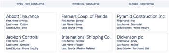
This seemed to me something that would useful for a wide range of records - anything with a status-like field really, which lead me to create Board Anything - a Lightning component that retrieves records for a particular SObject type, groups them by the value in a configurable status field and displays them as a table of Salesforce Lighting Design System board tiles - Leads for example:

Screen Shot 2016 01 16 at 17 10 36

Whatever, Where’s The Code

The Board Lightning Component

The board contents are displayed via a Lightning Component. In order for this component to be able to handle any type of sobject, there are a few attributes to configure its behaviour:

<aura:attribute name="SObjectType" type="String" default="Case" />
<aura:attribute name="StageValueField" type="String" default="Status" />
<aura:attribute name="StageConfigField" type="String" />
<aura:attribute name="FieldNames" type="String" default="CaseNumber,Subject" />
<aura:attribute name="ExcludeValues" type="String" default="Closed" />

These attributes influence the component as follows:

  • SObjectType - the type of SObject to display on the board
  • StageValueField - the field containing the stage (or status) values
  • StageConfigField - a picklist field containing the values to display on the board - use this if your StageValueField is a free text field to limit the stages that are displayed on the board
  • FieldNames - comma separated list of fields to display in each tile - the first is used as the title field for the tile
  • ExcludeValues - stage values that should be excluded from the board

Note that the defaults will result in a board of open cases being displayed as follows:

Screen Shot 2016 01 16 at 17 24 05

The component also defines design attributes for each of these attributes, so that you can configure a board via the Lightning Builder.

The component does most of its work on a list of wrapper classes. First it iterates the list  to output the stage headings, which will be in the order returned by the Schema Describe methods for the stage value field or stage config field, depending on which is defined:

 
<aura:iteration items="{!v.Stages}" var="stage">
  <th style="{!'width:' + v.ColumnWidth + '%'}">
     <h3 class="slds-section-title--divider slds-text-align--center">{!stage.stageName}</h3>
  </th>
</aura:iteration>

and then iterates the list again, displaying the tiles for each record in each stage:

<aura:iteration items="{!v.Stages}" var="stage">
  <td style="{!'width:' + v.ColumnWidth + '%; vertical-align:top'}">
    <aura:iteration items="{!stage.sobjects}" var="sobject">
      <ul class="slds-list--vertical slds-has-cards--space has-selections">
        <li class="slds-list__item slds-m-around--x-small">
          <div class="slds-tile slds-tile--board">
            <p class="slds-tile__title slds-truncate slds-text-heading--medium">{!sobject.titleField.fieldValue}</p>
            <div class="slds-tile__detail">
              <aura:iteration items="{!sobject.fields}" var="field">
                <p class="slds-truncate">{!field.fieldName} : {!field.fieldValue}</p>
              </aura:iteration>
            </div>
          </div>
        </li>
      </ul>
    </aura:iteration>
  </td>
</aura:iteration>

The Apex Controller

Most of the heavy lifting is done by the Apex controller, which gets the available stage values for the stage value field or stage config field:

if ( (null==stageConfigField))
{
  stageConfigField=stageValueField;
}
            
Map<String, String> excludeValuesMap=new Map<String, String>();
if (null!=excludeValues)
{
  for (String excludeValue : excludeValues.split(','))
  {
    excludeValuesMap.put(excludeValue, excludeValue);
  }
}
Map<String, BB_LTG_BoardStage> stagesByName=new Map<String, BB_LTG_BoardStage>();

Map<String, Schema.SObjectField> fieldMap =
             Schema.getGlobalDescribe().get(sobjectType).
		getDescribe().fields.getMap();
Schema.DescribeFieldResult fieldRes=
             fieldMap.get(stageConfigField).getDescribe();
            
List<Schema.PicklistEntry> ples = fieldRes.getPicklistValues();
for (Schema.PicklistEntry ple : ples)
{
  String stageName=ple.GetLabel();
  if (null==excludeValuesMap.get(stageName))
  {
    BB_LTG_BoardStage stg=new BB_LTG_BoardStage();
    stg.stageName=ple.GetLabel();
    stagesByName.put(stg.stageName, stg);
    stages.add(stg);
  }
}

Note that BB_LTG_BoardStage wrapper classes are created here - later these will be fleshed out with the records and their details.

It then generates a dynamic SOQL query to retrieve the named fields:

String queryStr='select Id,' + String.escapeSingleQuotes(stageValueField) + ', ' +
String.escapeSingleQuotes(fieldNames) +
                ' from ' + String.escapeSingleQuotes(sobjectType);
List<SObject> sobjects=Database.query(queryStr);

 and finally iterates the results of the query, grouping the records by stage and using dynamic DML to retrieve the field values: 

List<String> fieldNamesList=fieldNames.split(',');
for (SObject sobj : sobjects)
{
  String value=String.valueOf(sobj.get(stageValueField));
  BB_LTG_BoardStage stg=stagesByName.get(value);
  if (null!=stg)
  {
    BB_LTG_BoardStage.StageSObject sso=new
    BB_LTG_BoardStage.StageSObject();
    Integer idx=0;
    for (String fieldName : fieldNamesList)
    {
      fieldName=fieldName.trim();
      fieldRes= fieldMap.get(fieldName).getDescribe();
      BB_LTG_BoardStage.StageSObjectField ssoField=
                      new BB_LTG_BoardStage.StageSObjectField(fieldRes.getLabel(),
             sobj.get(fieldName));
      if (0==idx)
      {
        sso.titleField=ssoField;
      }
      else
      {
        sso.fields.add(ssoField);
      }
      idx++;
    }
    stg.sobjects.add(sso);
  }
}

What About the Example Leads Board?

The example Leads board is built using Lighting Out for Visualforce. As you may remember from my previous blog post on this, first I need to create an app that references the component, in this case BBSObjectBoardOutApp:

<aura:application access="GLOBAL" extends="ltng:outApp">
    <aura:dependency resource="c:BBSObjectBoard" />
</aura:application>

And then I have a Visualforce page (BBLeadBoard) that uses the app to instantiate the component and sets up the attributes to configure the board for leads:

<apex:page sidebar="false" showHeader="false" standardStylesheets="false">
    <apex:includeScript value="/lightning/lightning.out.js" />
    <div id="lightning"/>
 
    <script>
        $Lightning.use("c:BBSObjectBoardOutApp", function() {
            $Lightning.createComponent("c:BBSObjectBoard",
                                       {
					'SObjectType': 'Lead',
					'StageValueField' : 'Status',
					'FieldNames' : 'Company, FirstName, LastName, LeadSource',
					'ExcludeValues': 'Converted',
					},
                  "lightning",
                  function(cmp) {
                    // no further setup required - yet!
              });
        });
    </script>
</apex:page>

That’s All There Is?

No, there’s the wrapper class, a JavaScript controller and helper, but there’s nothing particularly exciting about those so they are available from my BBLDS samples repository at:

https://github.com/keirbowden/BBLDS

This also contains an unmanaged package so you can just install this into your dev org and try out the Visualforce page - check out the README for more information.

Anything Else I Need to Know

Yes.

  • As this is an unmanaged package there are test classes - you’re welcome.
  • The styling of the headings could be improved
  • Errors are written to the debug log and swallowed server side - I did this as otherwise the Lightning Builder displays exceptions all over the place when you try to update the attributes. Its not ideal, so feel free to change it!
  • No drag and drop support to change the stage/status value - while this makes sense for opportunities, it doesn’t for things like cases, so I used that as justification not to do it.

Related Posts


Saturday, 24 October 2015

LDS Activity Timeline, Lightning Components and Visualforce

LDS Activity Timeline, Lightning Components and Visualforce

Overview

One of the aspects of the Lightning Design System (LDS) that I particularly like is the example components, which means that I don't have to find a standard page with the feature that I want and scrape the HTML to replicate it.

A useful component for a variety of purposes is the Activity Timeline, which provides a visual overview of what has happened to a record, customer, anything you can think of really, and when. This is in use in a number of places in the new Lightning Experience UI to show activities, both future and historic.

In this post I'll show how to create an activity timeline component that displays the opportunities that have been closed won for a particular account record. I'll also be using the new Winter 16 feature that allows Lightning Components to be embedded inside a Visualforce page, which saves me having to write boilerplate JavaScript to pull the account Id parameter from the URL.

Remember that Winter 16 requires My Domain before Lightning Components can be displayed.

Update 31/10/2015 - @JennyJBennett pointed me at the Winter 16 release notes, which say:

— snip ---

Finally, you don’t need to enable My Domain to use Lightning components in the following contexts.

  • Lightning components with Communities in Community Builder
  • Lightning Components for Visualforce

— snip ---

Which means that you don’t need to enable My Domain to use the code in this blog post (though you will if you want to use the other components in my unmanaged package). This makes perfect sense as this is a security requirement, and Visualforce is already blocked from taking over other parts of the page/app via the browser’s same origin policy.

Show me the Code!

I didn't want to create a timeline that was tightly coupled to the opportunity sObject, instead I was looking for a more generic solution that could display any kind of data. I also didn't want the component to have to know too much about the information that it was displaying - components are much more re-usable if they just traverse a data structure and output what they find.

To this end, the timeline is modelled as a single Apex class, BBTimeline, with an inner class to represent an entry in the timeline. Note that the class fields are all annotated @AuraEnabled, to make them available for use the lightning component that renders them:

public class BB_LTG_Timeline {

    @AuraEnabled
    public String name {get; set;}
        
    @AuraEnabled
    public List<Entry> entries {get; set;}
        
    public BB_LTG_Timeline()
    {
        entries=new List<Entry>();
    }

    public class Entry
    {
        @AuraEnabled
        public Date theDate {get; set;}

        @AuraEnabled
        public String description {get; set;}
    }

}

There's then a custom Apex controller that builds the timeline object, in this case by retrieving the closed won opportunities from the database. It’s the responsibility of the method constructing the Timeline to add the entries in the desired order:

public class BB_LTG_AccountOppTimelineCtrl
{
    @AuraEnabled
    public static BB_LTG_Timeline GetTimeline(String accIdStr)
    {
        BB_LTG_Timeline result=new BB_LTG_Timeline();
        try
        {
            Id accId=(Id) accIdStr;
            System.debug('Account id = ' + accId);
            Account acc=[select id, Name from Account where id=:accId];
            result.name=acc.Name + ' closed deals';
            List<Opportunity> opps=[select CloseDate, Amount, Type
                                    from Opportunity
                                    where AccountId=:accId
                                      and StageName='Closed Won'
                                    order by CloseDate desc];

            for (Opportunity opp : opps)
            {
                BB_LTG_Timeline.Entry entry=new BB_LTG_Timeline.Entry();
                entry.theDate=opp.CloseDate;
                entry.description=opp.type + ' opportunity closed for ' + opp.amount;
                result.entries.add(entry);
            }
        }
        catch (Exception e)
        {
           System.debug('Exception - ' + e);
        }
        
        return result;
    }
}

Next there's the lightning component that outputs the timeline - BBAccountOppTimeline. This is pretty much lifted from the example in the Lightning Design System documentation. 

<aura:component controller="BB_LTG_AccountOppTimelineCtrl">
    <aura:attribute name="recordId" type="String" />
    <aura:attribute name="timeline" type="BB_LTG_Timeline" />
    
    <ltng:require styles="/resource/BB_SLDS091/assets/styles/salesforce-lightning-design-system-ltng.css"
    afterScriptsLoaded="{!c.doInit}" />
    
    <div class="slds">
        <c:BBAccountOppTimelineHeader />
        <ul class="slds-timeline">
            <p class="slds-m-around--medium"><a href="#">{!v.timeline.name}</a></p>
            <aura:iteration items="{!v.timeline.entries}" var="entry">
                <li class="slds-timeline__item">
                    <span class="slds-assistive-text">Event</span>
                    <div class="slds-media slds-media--reverse">
                        <div class="slds-media__figure">
                            <div class="slds-timeline__actions">
                                <button class="slds-button slds-button--icon-border-filled">
                                    <c:BBsvg class="slds-icon slds-icon-standard-event slds-timeline__icon" xlinkHref="/resource/BB_SLDS091/assets/icons/standard-sprite/svg/symbols.svg#event" />
                                    <span class="slds-assistive-text">Opportunity</span>
                                </button>
                                <p class="slds-timeline__date"><ui:outputDate value="{!entry.theDate}" /></p>
                            </div>
                        </div>
                        <div class="slds-media__body">
                            <div class="slds-media slds-media--timeline slds-timeline__media--event">
                                <div class="slds-media__figure">
                                    <c:BBsvg class="slds-icon slds-icon-standard-opportunity slds-timeline__icon" xlinkHref="/resource/BB_SLDS091/assets/icons/standard-sprite/svg/symbols.svg#opportunity" />
                                </div>
                                <div class="slds-media__body">
                                    <ul class="slds-list--vertical slds-text-body--small">
                                        <li class="slds-list__item slds-m-right--large">
                                            <dl class="slds-dl--inline">
                                                <dt class="slds-dl--inline__label">Description:</dt>
                                                <dd class="slds-dl--inline__detail"><a href="#">{!entry.description}</a></dd>
                                            </dl>
                                        </li>
                                    </ul>
                                </div>
                            </div>
                        </div>
                    </div>
                </li>
            </aura:iteration>
        </ul>
    </div>
</aura:component>

The JavaScript controller and helper, plus the supporting BBTimelineHeader component can be found in the unmanaged package or github repository via the links at the end of this post.

In order to display a Lightning Component in a Visualforce page, you need to construct a simple Lightning Application that is used as the bridge between the two technologies. This needs to have a dependency on the Lightning Component that will display the content - BBAccountOppTimeline in this case: 

<aura:application access="GLOBAL" extends="ltng:outApp">
    <aura:dependency resource="c:BBAccountOppTimeline" />
</aura:application>

Once the app is in place, there's a small amount of markup in the Visualforce page to tie things together - note that the Lightning Component is constructed dynamically via JavaScript, rather than being included in the page markup server side:

<apex:page sidebar="false" showHeader="false" standardStylesheets="false">
    <apex:includeScript value="/lightning/lightning.out.js" />
    <div id="lightning"/>

    <script>
        $Lightning.use("c:BBAccountOppTimelineApp", function() {
            $Lightning.createComponent("c:BBAccountOppTimeline",
                  { "recordId" : "{!$CurrentPage.parameters.id}" },
                  "lightning",
                  function(cmp) {
                    // any further setup goes here
              });
        });
    </script>
</apex:page>

The Results

Once all this scaffolding is in place, accessing the Visualforce page with the id of an account with at least one closed won opportunity displays a timeline of these opportunities, with the most recent at the top:

Screen Shot 2015 10 24 at 12 14 46


Where Can I Get It

As usual, I've added this into my BBLDS samples project available on github at :

https://github.com/keirbowden/BBLDS

Are there Test Classes?

Yes - this is available as an unmanaged package (there’s a link in the Github README), and you have to have test coverage to upload a package. Caveat emptor - these are purely focused on coverage!

Related Posts


Saturday, 10 October 2015

Responsive Design with the Lightning Design System

Responsive Design with the Lightning Design System

Screen Shot 2015 10 10 at 17 44 36

Introduction

The Lightning Design System was launched by Salesforce in August 2015 and, as I previously blogged, is the first time that Salesforce have made styles available to the developer community that allow us to build pages that match the standard look and feel perfectly (the standard look and feel for the Lightning Experience that is, Salesforce classic would still require style scraping).

The Lightning Design System offers more than just styling - it also provides a Responsive Grid to allow building of user interfaces that react to the device being used, to provide an appropriate experience tailored to the amount of screen real estate available.

Responsive Design

Overview

Wikipedia has a great definition of Responsive Design:

"Provide an optimal viewing experience – easy reading and navigation with a minimum of resizing, panning and scrolling – across a wide range of devices”.

From a technical perspective its a mechanism for building web pages so that they respond to the device that is displaying them. The page changes its content and layout based on the viewport size and orientation of the device. Ethan Marcotte first coined the phrase in his article on A List Apart, which is well worth a read.

An important point about responsive design is that its not about removing content for smaller devices - more and more of the web is accessed via mobile devices these days and you don’t want to punish people for accessing your content via a phone by only serving them part of what you have to offer.

Responsive Grid

A responsive grid breaks your page up into a collection of rows, each of which decomposes into a common number of columns. On a large device the row will contain all columns, while on an extra-small device such as a phone, the grid can reflow to display one column per row, stacking the columns vertically instead of laying them out horizontally.

This is achieved via CSS media queries - a media query is essentially CSS that limits its scope based on attributes of the device. For example, consider the following media query:

.sidebar {
    display: none;
}

@media (min-width: 1024px)  {
    .sidebar {
         display: block;
    }
}

 the initial CSS rule mandates that anything with a class of sidebar will be hidden by setting the display attribute to none. The next rule is constrained by a media query and only applies if the minimum width of the device is 1024 pixels. This rule overrides the sidebar style to make it visible by setting the display attribute to block. Thus any user accessing the page on a small device will not see content with the sidebar class, while those accessing from a large device will.

Note that in keeping with the principle that responsive design is not about removing content, if i were using this media query on a real page I would still allow users accessing from a mobile device to see the content, just not as part of a sidebar.

Responsive Images

Displaying the right images for a device form factor is an important part of responsive design, and I’ve written about this before in the following blog post

Lightning Design System

The Lightning Design System responsive grid is created by specifying a component with the style class slds-grid - I pretty much always use a div as that way I don’t get any additional behaviour outside of the container. Note that you also want to specify the style class slds-wrap, otherwise your grid will continue to layout columns horizontally and, if you are anything like me, you’ll waste a couple of hours digging through the HTML and CSS trying to figure out what is going on.

Inside the grid, elements with the style class slds-col define the column data. Additional style classes can be applied to dictate how the columns will flow based on the device size. For example, given the following layout for extra small and large devices:

Screen Shot 2015 09 28 at 09 16 59

In this scenario, on a small device I want each component to span the full width of the device, while on a large device I want the search/about component to appear in a smaller sidebar on the right hand side.

Using the responsive grid, I can keep the same content, but define different column spans based on the device itself. 

<div class="slds-grid slds-wrap">
    <div class="slds-col slds-size--1-of-1 slds-medium-size--3-of-4">
        ...
    </div>
    <div class="slds-col slds-size--1-of-1 slds-medium-size--1-of-4">
        ...
    </div>
</div>

As the grid styles are mobile first, whatever I specify as the default (slds-size—1-of-1) will apply from extra small upwards. My override for medium (slds-slds-medium-size—3-of-4) will apply to that device size and upwards, so covering medium and large devices.

Blog Posts App

Overview

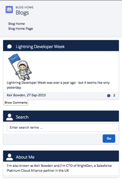
The sample blog post application conforms to the layout shown above - the main content of the page is a list of blog posts and for medium and large devices, their associated comments. There are additional elements to allow searching for posts containing matching text and about me content. On medium and large devices the additional elements are displayed to the right of the posts, while for extra small and small devices they are stacked under the main content. The Picturefill plugin displays different images for large, medium and small or less devices.

Here’s a screen shot for a large device:

Screen Shot 2015 10 04 at 13 36 54


a medium device (the only difference is the image):

Screen Shot 2015 10 04 at 13 37 19


and finally a small device - the difference here is the image, hidden comments and the right hand content stacked under the blog post body:

Screen Shot 2015 10 04 at 13 37 41

In order to view the sample you’ll need to deploy the code or install the managed package, as I haven’t yet found a way to make lightning components available via a Force.com site. I have hopes that the new lightning components in Visualforce functionality in the Winter 16 release will be the solution to this, but I haven’t had time to play with this in a site context.

This sample was originally written for a Dreamforce talk using Visualforce and Twitter Bootstrap - you can find out more about this in my developerforce blog post.

Gotchas

One thing that I’ve been struggling with and been unable to find a solution to, is conditionally hiding some content for multiple device sizes. When my blog posts are displayed on extra small or small devices, I want to hide the comments and provide a button to allow the user to display them. In something like Bootstrap I’d specify the button container with the classes hidden-md and hidden-lg. LDS doesn’t have an equivalent of this, so I’ve ended up using a span with a single LDS class - slds-x-small-show (which due to mobile-first means hidden for everything) and then adding another container inside this to hide the content for medium devices:

<span class="slds-x-small-show">
    <div class="medium-hide">
        ... button markup here ...
    </div>
</span>

The medium-hide style is as follows: 

/* hide medium and above */
@media all and (min-width: 768px) {
	.THIS .medium-hide {
        display:none;
	}
}


Responsive images also proved a challenge. I use the Picturefill polypill as the HTML5 picture element support is still lacking on some browsers. The latest version of this makes use of the Picture element but the developer console won’t let me save the a component with that markup. For now I’m sticking with version 1 of Picturefill which uses spans. I might take another look at this in the future, as I should be able to add the picture element via JavaScript as part of the initialisation.

When I started writing the code for this blog post, the version of the Lightning Design System was 0.9.1. As I already had a sample using 0.8 I left that alone so there are two static resources in the repository/unmanaged package. LDS is now on 0.9.2 and may well be higher by the time I finish writing the post!

My Domain Required in Winter 16

Don’t forget that the Winter 16 release requires my domain to be set up in order to use Lightning Components.

Code Repository

The code for this sample is available in my Lighting Design System Samples github repository at : 

https://github.com/keirbowden/BBLDS.

There’s also an unmanaged package that you can install to get all of the samples, through be aware that if you do this then the next time I produce a sample you’ll have to uninstall the managed package which will lose any blog data you’ve created.

Related Posts


Thursday, 10 September 2015

Ride the Lightning with Trailhead

Ride the Lightning with Trailhead

There’s a Badge for that

LightingX, or Lightning Experience, the new Salesforce front end was launched on August 25th 2015 to great fanfare. 

When major new features or products come out there’s a requirement for skilling up existing administrators, developers, consultants and partners, as well as the huge number of users of Salesforce. Previously this has involved watching videos that were more often than not produced for internal Salesforce use or particularly focused on an upcoming event, such as Dreamforce. For Lightning X, Salesforce have chosen to use the incredibly popular training tool that is Trailhead to get everyone up to speed.

There are four new LightningX trails:

  • Admin Trail - Migrating to Lightning Experience
    for admins who will be enabling LightingX on the org they manage
  • Admin Trail - Starting with Lightning Experience
    learn how to administer LightningX
  • Developer Trail - Lightning Experience
    for developers to learn how to build apps for LightningX using Lightning Components or Visualforce
  • Sales Rep Trail - Using Lightning Experience
    for users starting with LightningX

These trails are proving hugely popular - at the Q&A with Parker Harris on August 26th 2015, one fact bomb that was dropped was that a LightningX badge was being earned every 15 seconds, which is pretty impressive.

Now obviously I’ve done all of the trails, as I can’t help myself when new badges come online. but as a career developer the developer trail was the most interesting and the one I’m going to look at in a little more detail.

Developer Trail - Lightning Experience

Screen Shot 2015 09 10 at 14 19 16

This is one of the longer trails - with suggested timing of 10 hours 35 minutes its not something you’ll be able to knock out over a lunch hour, but is a better candidate for a quiet Saturday or Sunday in the run up to Dreamforce. Don’t be put off by a longer time - that means that you’ll be learning chapter and verse rather than just skimming the surface, which is exactly what you need if you are going to be selling clients on the benefits of LightningX. It also doesn’t matter if you are looking to continue developing in Visualforce or moving on to Lightning components, as both of these are supported by LightningX and covered in depth in the trail.

The trail not only takes you through the technology, but also provides guidance as to whether you should be jumping in to develop with LightningX or if you should be holding off until things are a little more mature - crucial for those organisations that are debating if they should switch to the new UI. There are also steps for ISV partners and changes to existing development tools, so really something for everyone.

As well as Lightning Components and Visualforce, the trail also introduces the Lightning Design System (LDS) - kind of  a huge deal for those of us that have been trying to build apps that look like Salesforce without trying ourselves into scraped CSS files and the like. Once you’ve earned the badge you can get hands on with the LDS through my blog post on Lightning Design System - Edit Parent and Child Records

There are 5 badges available for this trail, and we all know that Badgier = Better, which brings me on to ...

Badgier - A Perfectly Cromulent Word

In the last blog post that I wrote on Trailhead, I used the word ‘badgier’, which generated more than a little interest online. I’ve been racking my brains to come up with another, equally cromulent, word to embiggen this post.

One of my favourite German words is ‘schadenfreude', often translated as ‘shameful pride’, which is taking pleasure in the misfortunes of others. Based on this I am coining the term ‘badgenfreude’, aka badge pride, which means taking rightful pleasure in your hard earned Trailhead badges. So give yourself a well-deserved dose of badgenfreude and get your LightningX badges with minimal delay.

Related Posts