Showing posts with label css. Show all posts

Sunday, 11 December 2016

Lightning Design System in Visualforce Part 1 - Getting Started

Lightning Design System in Visualforce Part 1 - Getting Started

Lightningall

Introduction

A short while ago I wrote a Medium post containing tips for Visualforce developers moving over to Lightning Components. A pre-requisite for developing Lightning Components is being able to write JavaScript to some level, which isn’t something that every existing Visualforce developer has, especially those that from a functional background that have gained enough of an understanding of Visualforce and Apex to become productive, but aren’t in a position to quickly train themselves up on a new programming language. 

If you are in this boat, the good news is that if you don’t have JavaScript you can still create a custom user interface matching the Lightning Experience look and feel - simply carry on building Visualforce pages but use the Salesforce Lightning Design System (LDS) to style them.

Get the LDS

LDS is automatically included in various Lightning Component scenarios, but to use it with Visualforce you still need a static resource. Previously it was possible just to download a zip file, but now a custom scope is required in the CSS so you have to generate your own download via the CSS customizer tool. I chose BBLDS - if you go with something else, remember to update the CSS style classes in the sample code. Once you’ve generated the file, upload it to Salesforce as a static resource - I’ve gone with the name BBLDS_W17, again if you change this remember to update the references in the sample code.

Create the Basic Page

I create a new Visualforce page, making sure to check the box so that my page is available in LEX:

Screen Shot 2016 12 10 at 18 22 54

and change the <apex:page /> tag to the following:

<apex:page showHeader="false" sidebar="false" standardStylesheets="false"
           standardController="Account" applyHTmlTag="false">

Note that I have to turn off all aspects of standard Visualforce styling - no header, no sidebar and no standard stylesheets. The example page displays some basic details of an Account so I specify the Account standard controller. Finally, the applyHtmlTag attribute is set to false - this gives me control over the <html>, <head> and <body> tags, which is necessary to use the SVG icons in the LDS. Next, I add the <html> tag, specifying the SVG namespace information, followed by the <body> tag:

<html xmlns="http://www.w3.org/2000/svg" xmlns:xlink="http://www.w3.org/1999/xlink">
<body>

Next, I include the LDS - as noted above, if you’ve chosen a different name to BBLDS_W17, remember to change the name (and remember I die a little inside when my recommendations are rejected, but I accept that everyone has free will):

<apex:stylesheet value="{!URLFOR($Resource.BBLDS_W17,
                         'assets/styles/salesforce-lightning-design-system-vf.min.css')}" />

 Then I add the Lord of the Divs - one Div to rule them all - that wraps all content and specifies the LDS namespace. Again, if you haven’t used the same name as me (which hurts, it’s like a knife to my heart) remember to update the code:

<div class="BBLDS">

then I close everything off - the <div>, <body>, <html> and <page> tags.

Add LDS Components

The next task is to add some LDS components. Here I use the time-honoured approach of finding something in the LDS samples that looks appropriate, copying the sample and hacking it around, and I’d certainly recommend that approach when you first start out.

The first element I’ve added is the Record Home Page Header - I’m not going to cover the code in detail here, save for a couple of key points.

First - this is a Visualforce page so I can just drop in merge syntax to display details of the Account, for example:

<li class="slds-page-header__detail-block">
  <p class="slds-text-title slds-truncate slds-m-bottom--xx-small" title="Description">Description</p>
  <p class="slds-text-body--regular slds-truncate" title="{!Account.Description}">{!Account.Description}</p>
</li>

 gives me:

Screen Shot 2016 12 10 at 17 55 38

Second, SVG icons requires me to specify the location of the icon in the static resource file:

<div class="slds-media__figure">
  <svg aria-hidden="true" class="slds-icon slds-icon-standard-account">
    <use xlink:href="{!URLFOR($Resource.BBLDS_W17, 
'/assets/icons/standard-sprite/svg/symbols.svg#account')}">
</use>
</svg>
</div>

Screen Shot 2016 12 10 at 17 59 50

Third - I can still use standard component tags to generate formatted output:

<div class="slds-form-element slds-hint-parent slds-has-divider--bottom">
  <span class="slds-form-element__label">Created By</span>
  <div class="slds-form-element__control">
    <span class="slds-form-element__static">{!Account.CreatedBy.Name},
      &nbsp;<apex:outputField value="{!Account.CreatedDate}"/>
    </span>
  </div>
</div>


Screen Shot 2016 12 10 at 18 02 29

Note that I don’t use an output field tag to generate the details of the user that created the Account, as this has a side effect of adding a hover popup to the output link, which won’t be styled correctly as I’m not using any of the default Visualforce styling. Always consider the full effects of any standard component you use, and make sure you are happy with them - you don’t want to confuse your users with broken or half-styled elements.

Boring - where’s the final page?

Here’s  a screenshot of the final page - pretty simplistic, but definitely styled appropriately for LEX users:

Screen Shot 2016 12 10 at 18 07 33

Enough talk, show me the code

As usual with LDS posts, the code is in my LDS Samples Github Repository. There’s also an unmanaged package available to save wasting time copying and pasting - see the README.

In Conclusion

This post is in no way intended to suggest that you avoid learning Lightning Components in favour of making your Visualforce look like LEX. Lightning Components are the future and they are in and of LEX rather than iframed in from a different server, so you’ll be able to do a lot more with them in the future. I’d also imagine there isn’t a large team developing Visualforce nowadays, more likely a small team working on essential maintenance items, so you are unlikely to see much in the way of new features.

Related Posts


Saturday, 10 October 2015

Responsive Design with the Lightning Design System

Responsive Design with the Lightning Design System

Screen Shot 2015 10 10 at 17 44 36

Introduction

The Lightning Design System was launched by Salesforce in August 2015 and, as I previously blogged, is the first time that Salesforce have made styles available to the developer community that allow us to build pages that match the standard look and feel perfectly (the standard look and feel for the Lightning Experience that is, Salesforce classic would still require style scraping).

The Lightning Design System offers more than just styling - it also provides a Responsive Grid to allow building of user interfaces that react to the device being used, to provide an appropriate experience tailored to the amount of screen real estate available.

Responsive Design

Overview

Wikipedia has a great definition of Responsive Design:

"Provide an optimal viewing experience – easy reading and navigation with a minimum of resizing, panning and scrolling – across a wide range of devices”.

From a technical perspective its a mechanism for building web pages so that they respond to the device that is displaying them. The page changes its content and layout based on the viewport size and orientation of the device. Ethan Marcotte first coined the phrase in his article on A List Apart, which is well worth a read.

An important point about responsive design is that its not about removing content for smaller devices - more and more of the web is accessed via mobile devices these days and you don’t want to punish people for accessing your content via a phone by only serving them part of what you have to offer.

Responsive Grid

A responsive grid breaks your page up into a collection of rows, each of which decomposes into a common number of columns. On a large device the row will contain all columns, while on an extra-small device such as a phone, the grid can reflow to display one column per row, stacking the columns vertically instead of laying them out horizontally.

This is achieved via CSS media queries - a media query is essentially CSS that limits its scope based on attributes of the device. For example, consider the following media query:

.sidebar {
    display: none;
}

@media (min-width: 1024px)  {
    .sidebar {
         display: block;
    }
}

 the initial CSS rule mandates that anything with a class of sidebar will be hidden by setting the display attribute to none. The next rule is constrained by a media query and only applies if the minimum width of the device is 1024 pixels. This rule overrides the sidebar style to make it visible by setting the display attribute to block. Thus any user accessing the page on a small device will not see content with the sidebar class, while those accessing from a large device will.

Note that in keeping with the principle that responsive design is not about removing content, if i were using this media query on a real page I would still allow users accessing from a mobile device to see the content, just not as part of a sidebar.

Responsive Images

Displaying the right images for a device form factor is an important part of responsive design, and I’ve written about this before in the following blog post. 

Lightning Design System

The Lightning Design System responsive grid is created by specifying a component with the style class slds-grid - I pretty much always use a div as that way I don’t get any additional behaviour outside of the container. Note that you also want to specify the style class slds-wrap, otherwise your grid will continue to layout columns horizontally and, if you are anything like me, you’ll waste a couple of hours digging through the HTML and CSS trying to figure out what is going on.

Inside the grid, elements with the style class slds-col define the column data. Additional style classes can be applied to dictate how the columns will flow based on the device size. For example, given the following layout for extra small and large devices:

Screen Shot 2015 09 28 at 09 16 59

In this scenario, on a small device I want each component to span the full width of the device, while on a large device I want the search/about component to appear in a smaller sidebar on the right hand side.

Using the responsive grid, I can keep the same content, but define different column spans based on the device itself. 

<div class="slds-grid slds-wrap">
    <div class="slds-col slds-size--1-of-1 slds-medium-size--3-of-4">
        ...
    </div>
    <div class="slds-col slds-size--1-of-1 slds-medium-size--1-of-4">
        ...
    </div>
</div>

As the grid styles are mobile first, whatever I specify as the default (slds-size—1-of-1) will apply from extra small upwards. My override for medium (slds-slds-medium-size—3-of-4) will apply to that device size and upwards, so covering medium and large devices.

Blog Posts App

Overview

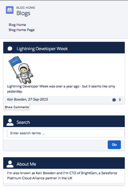
The sample blog post application conforms to the layout shown above - the main content of the page is a list of blog posts and for medium and large devices, their associated comments. There are additional elements to allow searching for posts containing matching text and about me content. On medium and large devices the additional elements are displayed to the right of the posts, while for extra small and small devices they are stacked under the main content. The Picturefill plugin displays different images for large, medium and small or less devices.

Here’s a screen shot for a large device:

Screen Shot 2015 10 04 at 13 36 54


a medium device (the only difference is the image):

Screen Shot 2015 10 04 at 13 37 19


and finally a small device - the difference here is the image, hidden comments and the right hand content stacked under the blog post body:

Screen Shot 2015 10 04 at 13 37 41

In order to view the sample you’ll need to deploy the code or install the managed package, as I haven’t yet found a way to make lightning components available via a Force.com site. I have hopes that the new lightning components in Visualforce functionality in the Winter 16 release will be the solution to this, but I haven’t had time to play with this in a site context.

This sample was originally written for a Dreamforce talk using Visualforce and Twitter Bootstrap - you can find out more about this in my developerforce blog post.

Gotchas

One thing that I’ve been struggling with and been unable to find a solution to, is conditionally hiding some content for multiple device sizes. When my blog posts are displayed on extra small or small devices, I want to hide the comments and provide a button to allow the user to display them. In something like Bootstrap I’d specify the button container with the classes hidden-md and hidden-lg. LDS doesn’t have an equivalent of this, so I’ve ended up using a span with a single LDS class - slds-x-small-show (which due to mobile-first means hidden for everything) and then adding another container inside this to hide the content for medium devices:

<span class="slds-x-small-show">
    <div class="medium-hide">
        ... button markup here ...
    </div>
</span>

The medium-hide style is as follows: 

/* hide medium and above */
@media all and (min-width: 768px) {
	.THIS .medium-hide {
        display:none;
	}
}


Responsive images also proved a challenge. I use the Picturefill polypill as the HTML5 picture element support is still lacking on some browsers. The latest version of this makes use of the Picture element but the developer console won’t let me save the a component with that markup. For now I’m sticking with version 1 of Picturefill which uses spans. I might take another look at this in the future, as I should be able to add the picture element via JavaScript as part of the initialisation.

When I started writing the code for this blog post, the version of the Lightning Design System was 0.9.1. As I already had a sample using 0.8 I left that alone so there are two static resources in the repository/unmanaged package. LDS is now on 0.9.2 and may well be higher by the time I finish writing the post!

My Domain Required in Winter 16

Don’t forget that the Winter 16 release requires my domain to be set up in order to use Lightning Components.

Code Repository

The code for this sample is available in my Lighting Design System Samples github repository at : 

https://github.com/keirbowden/BBLDS.

There’s also an unmanaged package that you can install to get all of the samples, through be aware that if you do this then the next time I produce a sample you’ll have to uninstall the managed package which will lose any blog data you’ve created.

Related Posts


Sunday, 6 September 2015

Lightning Design System - Edit Parent and Child Records

Lightning Design System - Edit Parent and Child Records

Screen Shot 2015 09 06 at 08 39 55

Introduction

Salesforce introduced the Lightning Design System as part of the new Lightning Experience UX at the end of August 2015. The Salesforce Lightning Design System (SLDS) is the first time that Salesforce have provided the developer community with the CSS, fonts and icons to allow us to build UI components that match the LightningX look and feel. This means no more fragile solutions that pull in the standard stylesheets or wholesale cloning of the standard stylesheets into static resources. In my case it also likely means the end of using Bootstrap for Salesforce1 applications, although as LDS is currently only at version 0.8 I’ll probably give it a few more versions before I move over completely.

After a browsing the docs I was keen to give the SLDS a spin and decided to combine this with another idea I’ve been toying with - taking some of my Visualforce solutions that I’ve blogged about and rebasing those onto Lightning components. So the first sample I’m going with is editing parent and child records on a single screen.

You can find the original Visualforce-centric post here - I haven’t gone for feature-parity with that post, specifically around creating and deleting child records, as there is enough to cover without that, although I may add that in a later version. As always, I’ve gone with the Account sobject as the parent and Contact as the children.

Getting Started with the SLDS

Screen Shot 2015 09 06 at 08 17 00

If you haven’t looked at the SLDS yet, the best place to start (as with so many things Salesforce) is by getting your Trailhead badge for the Lightning Design System module.

Designing the Screen

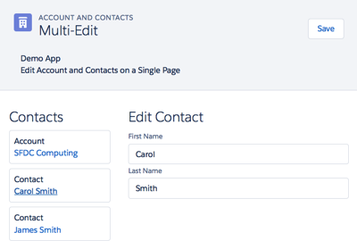
When working with Lightning Components I find its useful to sketch out the layout before starting the development - the greater the degree of granularity, the more reuse you are likely to get. This was made much easier in this case as I decided to use the LDS Master Detail Layout, consisting of the following components:

  • A page header
  • A list of cards for the account and contact records
  • A central form area to allow editing of the selected account or contact record

Here’s a screenshot of the completed page:

Screen Shot 2015 09 05 at 14 19 46

Once I had the basic layout I could start building the various components. I decided to go with a Lightning Application to host the page, as it meant I could navigate to it directly via a URL rather than having to build a navigation mechanism, which is a blog post all to itself!

Implementing the Application

There are quite a few elements to this solution, so I don’t intend to go through the code for all of them. The following sections detail some of the areas that I think are interesting - your mileage may vary - if there’s anything that I haven’t explained that you’d like to know more about, let me know in the comments and I’ll do my best to oblige. You can access the full codebase via the link to the Github repository at the end of this post.

The Application

The key part of the app markup is shown below:

<div class="slds">
    <c:BBAppHeader appEvent="{!c.appEvent}"/>
    <div class="slds-grid slds-wrap slds-p-top--x-small">
        <div class="slds-col slds-size--1-of-3 slds-p-around--medium">
             <c:BBAccountContactList account="{!v.account}"
                                     contacts="{!v.contacts}"
			             selectedContact="{!v.selectedContact}"
                                     editingContact="{!v.editingContact}" />
        </div>
        <aura:if isTrue="{!v.editingContact}">
            <div class="slds-col slds-size--2-of-3 slds-p-around--medium">
                <c:BBContactEditForm contact="{!v.selectedContact}" />
            </div>
        </aura:if>
        <aura:if isTrue="{! (!v.editingContact)}">
            <div class="slds-col slds-size--2-of-3 slds-p-around--medium">
                <c:BBAccountEditForm account="{!v.account}" />
            </div>
        </aura:if>
    </div>
</div>

The markup is wrapped in a div with the class ‘slds’ as the LDS is namespaced - so any styles that I use need to be inside an ancestor with this class or they will revert back to very ordinary looking HTML. 

The left and right components, are rendered inside an LDS grid, as I want to fix the size of each of them relative to each other.

The left hand component, the list of account and contact cards, takes up 1/3 of the available space, so is wrapped in a  div with the class “slds-size—1-of-3’ indicating that this div takes up one column out of a total of three available in the grid. The component takes an ‘editingContact’ attribute, which is set to true when the user clicks on a contact card and false when the user clicks on the account card.

The right hand component is wrapped inside a div with the class ‘slds-size—2-of-3’ indicating that it should take up two of the available three columns, or 2/3 of the available space. Depending on the value of the ‘editingContact’ attribute a form is rendered to allow the account or selected contact to be edited.  Note that I’ve enclosed each from in its own aura:if component - while I could use the ‘else’ attribute, I find it more readable to draw out the conditional rendering in this way. Note also that I’ve repeated the containing div for each conditionally rendered component - I could put this outside the aura:if components, but I’ve gone this route so that if I need to I can apply different styling to the containing div based on whether the user is editing the account or a contact, although at present the styling is identical. Note that I’ve also added a style class of ‘slds-p-around—medium’ to add some padding to the left and right components, otherwise they will butt up hard against each other.

URL Parameters

The id of the account to edit is picked up from the URL - I couldn’t find a mechanism for this that is provided by the Lightning framework, so I’m pulling it via a JavaScript method in the application's helper:

getURLParameter : function(param) {
	var result=decodeURIComponent((new RegExp('[?|&]' + param + '=' + '([^&;]+?)(&|#|;|$)').exec(location.search)||[,""])[1].replace(/\+/g, '%20'))||null;
        return result;
}

The application helper then retrieves the account and contacts for the ID via a server side request:

var action = cmp.get("c.GetAccountAndContacts");
var params={"accountIdStr":accountId};
action.setParams(params);
        
var self = this;
action.setCallback(this, function(response) {
    try {
        self.actionResponseHandler(response, cmp, self, self.gotAccount);
    }
    catch (e) {
        alert('Exception ' + e);
    }
});
$A.enqueueAction(action);

Note that I delegate the handling of the response from the server to a generic method - actionResponseHandler, which takes a parameter of the method that will actually handle the response - self.gotAccount in this case. This allows me to decouple all of the error handling around the request itself from the code that will process the response and update the data model. Note also that I pass the component itself, and the ‘self’ instance of the helper to the response handler - these are in turn passed to the gotAccount method so that when processing the response I can access attributes from the component or helper methods if I need to.

Component Event

The app header component takes an attribute of ‘appEvent’ that specifies a handler for a component event that is fired when the ‘Save' button in the header is clicked. As I plan to re-use the app header in the future, I don’t want to tie it to the expected behaviour of the page. Instead when the user clicks a button, an event is fired indicating the button that was clicked, which allows the containing application to decide what action to take. 

The app header declares the type of event that it will fire, and the name of the attribute that will contain the handler:

<aura:registerEvent name="appEvent" type="c:BBAppEvent" />

The ‘Save' button specifies an onclick handler:

<button class="slds-button slds-button--neutral" onclick="{!c.fireSaveEvent}">Save</button>

The handler constructs the event, specifies which button the user clicked and fires the event:

var appEvent = cmp.getEvent("appEvent");
appEvent.setParams({"action" : "save"});
appEvent.fire();

The containing app receives the event through its declared handler and saves the records to the server: 

appEvent : function(cmp, ev) {
    var action=ev.getParam("action");
    if (action=="save") {
        this.save(cmp);
    }
}

Two Way Attribute Binding

Aside from the event fired from the header component, two-way binding is used to “communicate’ updates between the various components. Using this mechanism means that any updates made to an account or contact in the editing form are also reflected in the account/contact list component, as references to the records are passed through the attribute binding. This means that the same variable instance is used in each component, so a change in one component is automatically picked up by any other component using that variable instance without any additional intervention on the part of my JavaScript.

SLDS Markup

If you aren’t used to CSS frameworks, SLDS can look like it introduces a lot of markup for containing divs etc and a lot of style classes, for example here’s a snippet from the app header:

<div class="slds-page-header">
    <div class="slds-grid">
        <div class="slds-col slds-has-flexi-truncate">
            <div class="slds-media">
                <div class="slds-media__figure">
                    <span class="slds-icon__container slds-icon-standard-account">
                        <c:BBsvg class="slds-icon" xlinkHref="/resource/BB_SLDS080/assets/icons/standard-sprite/svg/symbols.svg#account" />
                        <span class="slds-assistive-text">Account Icon</span>
                    </span>
                </div>
                ...
            </div>
        </div>
    </div>
</div>

All I can say here is that it becomes less jarring over time, as anyone who has spent time working with the Bootstrap framework can attest. One thing it does encourage you to do is to decompose your components as much as possible, to keep the amount of markup short and readable.

Github Repository

Related Posts


Saturday, 27 October 2012

Building a Templated Web Site with Force.com - Part 1

An area of Salesforce that often seems underrated to me is Force.com sites.  If you are an Enterprise or Unlimited Edition customer, you can create up to 25 sites with a total hosting cost of zero down and zero a month. All you need is some Visualforce capability, and maybe Apex if you want to hook the site up with your Salesforce records. 

If you've been following this blog for a while, you'll know there's a couple of web sites that I've built using Force.com sites:

  • http://www.bobbuzzard.org/ - this is a site I use to demonstrate some interesting (hopefully) Force.com functionality, including Dojo charting, an opportunity progression chart and a mobile survey application
  • http://tests.bobbuzzard.org/ - my online tests site, allowing Force.com developers to test their knowledge of various features of the platform.  This has proved quite popular I'm very pleased to say.
My company, BrightGen, also moved our website to Force.com sites earlier this year. For us this decision was more about maximising our capability to maintain the site rather than hosting costs.  As we have a large pool of Apex and Visualforce developers, it means that we aren't reliant on a third party to make changes at short notice.
 
 In this series of posts I'll show you how to build a templated web site from scratch.  

Choosing Your Template

A templated web site simply means that the content that is repeated across all pages (header, footer, sidebar etc) is generated from a template.  Each page on the web site uses this template as its starting point and injects its specific content.  So a contact us page, for example, would have the same header and footer as a news page, but would inject a form that the end user can fill in to make contact.  When we moved the BrightGen web site to Force.com sites, each of the pre-existing pages had the header, footer and sidebar repeated in each page, so we had to spend some time analysing those to build a template that worked for all of them.  For the purposes of my demo site, I'm going to start with a clean sheet which makes it a lot more straightforward.

The first thing you might be tempted to do when building a Force.com site is to dive straight in and configure the site.  However, as the site is based on Visualforce pages, I prefer to get a basic version available before making it available externally.  Thus the first step for me is always to decide on the template that I'm going to use.

If you look closely at either of the Bob Buzzard sites I've mentioned above, you'll see the following text in the footer:

     Design by FCT.

FCT stands for Free CSS Templates and these are free as in beer.  The only requirement is that you link back to the http://www.freecsstemplates.org/ website.  As any template you download will have a link somewhere on the page already, its often just a case of leaving an area of the page alone!  I've gone for the defrost template, as shown below:


The templates are downloadable as a zip file. There's not a lot to them, as can be seen by the expanded contents of the file:


The index.html is the example page from the template gallery - this is a key file for me as I'll be using this as the basis for my site template, so the first thing I do is to extract this to my local file system.  As I'll be using the images and css on my site, I need to make it available via the Force.com platform, so I upload the zip as a static resource named 'Defrost'.  Make sure to set the Cache Control to Public when uploading the static resource, as this will make your site more performant when you release it into the wild.

Next up I need to convert the index.html page into a Visualforce page.  As I'm going to be using this as my template and I'm exceptionally creative, I've named my page 'template'.  To get started, I paste the contents of the html file into my new Visualforce page:


<!DOCTYPE html PUBLIC "-//W3C//DTD XHTML 1.0 Strict//EN" "http://www.w3.org/TR/xhtml1/DTD/xhtml1-strict.dtd">
<!--
Design by Free CSS Templates
http://www.freecsstemplates.org
Released for free under a Creative Commons Attribution 2.5 License

Name       : Defrost
Description: A two-column, fixed-width design with dark color scheme.
Version    : 1.0
Released   : 20111121

-->
<html xmlns="http://www.w3.org/1999/xhtml">
<head>
<meta name="keywords" content="" />
<meta name="description" content="" />
<meta http-equiv="content-type" content="text/html; charset=utf-8" />
<title>Defrost by FCT</title>
<link href="http://fonts.googleapis.com/css?family=Oxygen" rel="stylesheet" type="text/css" />
<link href="style.css" rel="stylesheet" type="text/css" media="screen" />
</head>
<body>
<div id="wrapper">
	<div id="header-wrapper">
		<div id="header">
			<div id="logo">
				<h1><a href="#">Defrost</a></h1>
				<p>template design by free <a href="http://www.freecsstemplates.org/">FCT</a></p>
			</div>
		</div>
	</div>
	<!-- end #header -->
	<div id="menu">
		<ul>
			<li class="current_page_item"><a href="#">Homepage</a></li>
			<li><a href="#">Blog</a></li>
			<li><a href="#">Photos</a></li>
			<li><a href="#">About</a></li>
			<li><a href="#">Links</a></li>
			<li><a href="#">Contact</a></li>
		</ul>
	</div>
	<!-- end #menu -->
	<div id="page">
		<div id="page-bgtop">
			<div id="page-bgbtm">
				<div id="content">
					<div class="post">
						<h2 class="title"><a href="#">Welcome to Defrost</a></h2>
						<div class="entry">
							<p><img src="images/pics01.jpg" width="600" height="200" alt="" />This is <strong>Defrost</strong>, a free, fully standards-compliant CSS template designed by  <a href="http://www.freecsstemplates.org">FCT</a>.  The picture in this template is from <a href="http://fotogrph.com/">FotoGrph</a>.This free template is released under a <a href="http://creativecommons.org/licenses/by/3.0/">Creative Commons Attributions 3.0</a> license, so you’re pretty much free to do whatever you want with it (even use it commercially) provided you keep the links in the footer intact. Aside from that, have fun with it :)</p>
						</div>
					</div>
					<div class="post">
						<h2 class="title"><a href="#">Lorem ipsum sed aliquam</a></h2>
						<div class="entry">
							<p><img src="images/pics02.jpg" width="600" height="200" alt="" />Sed lacus. Donec lectus. Nullam pretium nibh ut turpis. Nam bibendum. In nulla tortor, elementum vel, tempor at, varius non, purus. Mauris vitae nisl nec metus placerat consectetuer. Donec ipsum. Proin imperdiet est. Phasellus <a href="#">dapibus semper urna</a>. Pellentesque ornare, consectetuer nisl felis ac diam. Sed lacus. Donec lectus. Nullam pretium nibh ut turpis. Nam bibendum. Mauris vitae nisl nec metus placerat consectetuer. </p>
						</div>
					</div>
					<div class="post">
						<h2 class="title"><a href="#">Phasellus pellentesque turpis </a></h2>
						<div class="entry">
							<p><img src="images/pics01.jpg" width="600" height="200" alt="" />Sed lacus. Donec lectus. Nullam pretium nibh ut turpis. Nam bibendum. In nulla tortor, elementum vel, tempor at, varius non, purus. Mauris vitae nisl nec metus placerat consectetuer. Donec ipsum. Proin imperdiet est. Pellentesque ornare, orci in consectetuer hendrerit, urna elit eleifend nunc. Donec ipsum. Proin imperdiet est. Pellentesque ornare, orci in consectetuer hendrerit, urna elit eleifend nunc.</p>
						</div>
					</div>
					<div style="clear: both;">&nbsp;</div>
				</div>
				<!-- end #content -->
				<div id="sidebar">
					<ul>
						<li>
							<h2>Aliquam tempus</h2>
							<p>Mauris vitae nisl nec metus placerat perdiet est. Phasellus dapibus semper consectetuer hendrerit.</p>
						</li>
						<li>
							<h2>Categories</h2>
							<ul>
								<li><a href="#">Aliquam libero</a></li>
								<li><a href="#">Consectetuer adipiscing elit</a></li>
								<li><a href="#">Metus aliquam pellentesque</a></li>
								<li><a href="#">Suspendisse iaculis mauris</a></li>
								<li><a href="#">Urnanet non molestie semper</a></li>
								<li><a href="#">Proin gravida orci porttitor</a></li>
							</ul>
						</li>
						<li>
							<h2>Blogroll</h2>
							<ul>
								<li><a href="#">Aliquam libero</a></li>
								<li><a href="#">Consectetuer adipiscing elit</a></li>
								<li><a href="#">Metus aliquam pellentesque</a></li>
								<li><a href="#">Suspendisse iaculis mauris</a></li>
								<li><a href="#">Urnanet non molestie semper</a></li>
								<li><a href="#">Proin gravida orci porttitor</a></li>
							</ul>
						</li>
						<li>
							<h2>Archives</h2>
							<ul>
								<li><a href="#">Aliquam libero</a></li>
								<li><a href="#">Consectetuer adipiscing elit</a></li>
								<li><a href="#">Metus aliquam pellentesque</a></li>
								<li><a href="#">Suspendisse iaculis mauris</a></li>
								<li><a href="#">Urnanet non molestie semper</a></li>
								<li><a href="#">Proin gravida orci porttitor</a></li>
							</ul>
						</li>
					</ul>
				</div>
				<!-- end #sidebar -->
				<div style="clear: both;">&nbsp;</div>
			</div>
		</div>
	</div>
	<!-- end #page -->
</div>
<div id="footer">
	<p>Copyright (c) 2012 Sitename.com. All rights reserved. Design by <a href="http://www.freecsstemplates.org/">FCT</a>. Photos by <a href="http://fotogrph.com/">fotogrph</a>.</p>
</div>
<!-- end #footer -->
</body>
</html>

Attempting to save this page as-is will result in failure, as it isn't a well formatted Visualforce page.  To fix that I need to wrap the page in an <apex:page> component and change the doctype from an element to an attribute of the <apex:page>.  I also remove the header, sidebar and standard stylesheets as I want the page only to use the defrost styling.  This allows the page to save, but accessing the page shows that the job isn't done yet:

This is because the css and image elements don't have the correct path - they still have relative paths based on the original zip file.  While fixing these up I also take the opportunity to convert them to the equivalent Visualforce elements - <apex:styleSheet> and <apex:image>.  As I have the resources available in my zipped static resource, I use the URLFOR function to access the zip contents.

Here's an example of each before: 

<link href="style.css" rel="stylesheet" type="text/css" media="screen" />
<img src="images/pics01.jpg" width="600" height="200" alt="" />

 and after:

<apex:stylesheet value="{!URLFOR($Resource.Defrost, 'style.css')}"/>
<apex:image url="{!URLFOR($Resource.Defrost, 'images/pics01.jpg')}" alt="" width="600" height="200"/>

Accessing the page again shows that my changes have done the trick and it is now rendering the same as the original index.html (I've included the location bar of my browser just to prove there's no trickery):

The updated version of this page and the defrost zip file are available in the Part 1 directory of the github repository for this blog series at:

https://github.com/keirbowden/blog_force_com_sites

In the next post I'll look at how we can take this page and turn it into the template for our site, and create a home page based on that template.  


Sunday, 9 September 2012

Online Quizzes Built on Force.com

If you're a Facebook friend of mine, over the last few weeks you'll have seen status updates regarding an online quiz app that I've been working on.  I started off calling it an online testing system, but decided against that as it had too many connotations of an app that allowed unit tests to be executed!

My original idea for the app was to use it to determine individual's readiness for Salesforce certification exams and crowdsource the questions as a free for all. However, I'm rethinking how the questions will be authored based on the various compromises of real questions that have taken place this year.  I'm still planning to allow the community access to author questions, but in a more controlled fashion and limiting the number of questions an individual can write on a single topic.

A screenshot of a question is shown below :


One of the key aspects for me is the ability for candidates to give a percentage rating to their confidence in the answer.  This is based on my approach to taking the real exams, as it allows me to determine how close I think I am to the pass mark.  I find it particularly useful when assessing a candidate's readiness, as if they are getting questions wrong when they were 100% confident in their answer, that implies there is a fundamental lack of understanding in that particular concept.  There's also a couple of free text areas for candidate notes and feedback on each question.

Each question is marked with a topic, which identifies which test it belongs to, and an area which is simply a free text sub-topic - Workflow is an area under the Force.com topic for example. The areas are used to provide feedback to candidates about areas they are weak on - at the moment its simply the first five unique areas encountered when marking.  I do plan to make this more sophisticated, taking into account the candidate's confidence and the number of incorrect answer in each area, for example

Something that applies both to tests and surveys (and many other question and answer scenarios) is the requirement to decouple the questions from those presented in a test instance. For example, if a questions is worded incorrectly and I fix it, I don't want to retrospectively update that question as posed to a particular candidate, as its not the question they answered. The trick here is to have the concept of questions as templates, and clone these when creating a test instance. Mine are called question responses, and that is where things like the feedback live.

Questions can be single answer (radio button), multi-answer (checkboxes), putting answers in order (picklists) or free text (long text area). The first three are automatically marked when the test is submitted, while free text requires a human to review the text.

As I want to be able to have (at least) users and contacts as test candidates, I couldn't use master-detail relationships and standard roll up summary fields. Instead I used this excellent utility from Anthony Victorio that allows roll up summary behaviour via regular lookup fields. It only takes a few minutes to set up and has worked fine for me thus far. The only trick is to remember to "touch" all the child objects when you add a new parent summary field.

The app is built on Force.com sites using composition templates.  The design is from Free CSS Templates - a great resource if, like me, design isn't your strong suit.

At the moment there's just a single test on Dreamforce X to allow me to test the site out in a controlled fashion.  So give it a go and let me know what you think.  If you would be interested in writing or marking questions, please tick the boxes on the test signup form.  On the results page there's a link to tweet out the score - don't feel any pressure to do this, but if you do want to that would be cool.


You can access the site at: http://tests.bobbuzzard.org

Saturday, 30 June 2012

HTML Comments in Visualforce Pages

After seeing the presentation from Wes Nolte at Cloudstock London, I've been playing around with knockout.js in my spare time over the last couple of weeks and am very impressed.  I've been building some apps using JQuery Mobile and an area of concern has been the way that I've been striping HTML through javascript functions in order to update page sections with the latest data - using knockout.js I don't have to worry about this any more as I can bind the data and respond to user interaction via an almost Apex controller-like javascript object.

One of the feature of knockout.js is the ability to iterate an array of data via a foreach.  With HTML containers that naturally contain a repeating body (e.g. TBODY or UL) the data can be bound directly to that element. However, if you have a block of markup that you want to repeat without a container (in my case it was simply a DIV element per entry in the array), you make use of HTML comments to wrap the body.  An example of this is shown below, where there is a single static list item and the rest are generated from an array:

<ul>
<li><strong>Days of week:</strong></li>
 <!-- ko foreach: daysOfWeek -->
 <li>
  <span data-bind="text: $data"></span>
 </li>
 <!-- /ko -->
</ul>

<script type="text/javascript">
function viewModel() {
  var self = this;
  self.daysOfWeek = ko.observableArray([
   'Monday', 'Tuesday', 'Wednesday', 'Thursday', 'Friday', 'Saturday', 'Sunday'
  ]);
};
ko.applyBindings(new viewModel());
</script>

In this case the <!-- ko foreach: daysOfWeek --> comment indicates that everything between it and the <!-- /ko --> end comment should be repeated for each element in the daysOfWeek array of Strings, and the <span> inside each list element should be populated with the array element via the data-bind="text: $data" attribute.  


After saving this markup in my Visualforce page, I viewed the page to be disappointed by the sight of a single list item with the text 'null' in the embedded span.  As I was green to this framework, my initial assumption was that I'd done something wrong.  Observable elements need to be accessed as a function rather than an attribute, so maybe I needed some additional brackets in there?  That just made things worse.  I then added in some debug to output the size of the array in case I'd made a mistake there, and that showed that there were 7 elements as expected.  To check that there wasn't an issue with the javascript file I'd downloaded, I rewrote it to use the UL element as a container and that worked fine.  Some googling showed that nobody else was having this problem, so it was clearly something that I was doing.  After some more head scratching and unsuccessful tweaks a synapse fired and I remembered having a similar issue when attempting to use CSS conditional comments for IE. These comments are interpreted by IE and ignored by all other browsers, so allow specific code or includes to be executed for the IE browser:
<!--[if IE 6]>
Special instructions for IE 6 here
<![endif]-->

I couldn't remember the exact issue, but I'd ended up writing a controller that inspected the USER-AGENT header as I couldn't make it work in the page.  Once I'd found the notes it came flooding back - Visualforce removes HTML comments.  Checking the source of my rendered page confirmed this - my bounding comments were nowhere to be seen.  Moving the logic to the controller wasn't an option here, so I started looking for a workaround.

My first thought was to place the comments inside outputtext tags with the escape attribute set to false:

<apex:outputText escape="false" value="< -- ko foreach: daysOfWeek -->" />

While this was successful in outputting an HTML comment, the body was replaced with asterisks, hardly helpful:

<-- ********************** -->

I really don't understand why this happens - either leave the comment alone or remove it. Mangling helps nobody and adds unnecessary characters to the page.

After a bit more experimentation I came up with the following notation:

<apex:outputText value="<" escape="false"/>!-- ko foreach: daysOfWeek --<apex:outputText value=">" escape="false"/>

It looks pretty ugly but does the trick.  By the way, if you are thinking that this could be made more readable using a custom component, I thought the same, but custom components get wrapped in a bonus <span> element, which broke things.

Upon changing my example markup to:

<ul>
<li><strong>Days of week:</strong></li>
 <apex:outputText value="<" escape="false"/>!-- ko foreach: daysOfWeek --<apex:outputText value=">" escape="false"/>
 <li>
  <span data-bind="text: $data"></span>
 </li>
 <apex:outputText value="<" escape="false"/>!-- /ko --<apex:outputText value=">" escape="false"/>
</ul>
<script type="text/javascript">
function viewModel() {
  var self = this;
  self.daysOfWeek = ko.observableArray([
   'Monday', 'Tuesday', 'Wednesday', 'Thursday', 'Friday', 'Saturday', 'Sunday'
  ]);
};
ko.applyBindings(new viewModel());
</script>

Everything started working as expected and my faith in knockout.js was restored.  If you agree that HTML comments should be left in the resulting page, please vote up my idea.