Saturday, 24 October 2015

LDS Activity Timeline, Lightning Components and Visualforce

LDS Activity Timeline, Lightning Components and Visualforce

Overview

One of the aspects of the Lightning Design System (LDS) that I particularly like is the example components, which means that I don't have to find a standard page with the feature that I want and scrape the HTML to replicate it.

A useful component for a variety of purposes is the Activity Timeline, which provides a visual overview of what has happened to a record, customer, anything you can think of really, and when. This is in use in a number of places in the new Lightning Experience UI to show activities, both future and historic.

In this post I'll show how to create an activity timeline component that displays the opportunities that have been closed won for a particular account record. I'll also be using the new Winter 16 feature that allows Lightning Components to be embedded inside a Visualforce page, which saves me having to write boilerplate JavaScript to pull the account Id parameter from the URL.

Remember that Winter 16 requires My Domain before Lightning Components can be displayed.

Update 31/10/2015 - @JennyJBennett pointed me at the Winter 16 release notes, which say:

— snip ---

Finally, you don’t need to enable My Domain to use Lightning components in the following contexts.

  • Lightning components with Communities in Community Builder
  • Lightning Components for Visualforce

— snip ---

Which means that you don’t need to enable My Domain to use the code in this blog post (though you will if you want to use the other components in my unmanaged package). This makes perfect sense as this is a security requirement, and Visualforce is already blocked from taking over other parts of the page/app via the browser’s same origin policy.

Show me the Code!

I didn't want to create a timeline that was tightly coupled to the opportunity sObject, instead I was looking for a more generic solution that could display any kind of data. I also didn't want the component to have to know too much about the information that it was displaying - components are much more re-usable if they just traverse a data structure and output what they find.

To this end, the timeline is modelled as a single Apex class, BBTimeline, with an inner class to represent an entry in the timeline. Note that the class fields are all annotated @AuraEnabled, to make them available for use the lightning component that renders them:

public class BB_LTG_Timeline {

    @AuraEnabled
    public String name {get; set;}
        
    @AuraEnabled
    public List<Entry> entries {get; set;}
        
    public BB_LTG_Timeline()
    {
        entries=new List<Entry>();
    }

    public class Entry
    {
        @AuraEnabled
        public Date theDate {get; set;}

        @AuraEnabled
        public String description {get; set;}
    }

}

There's then a custom Apex controller that builds the timeline object, in this case by retrieving the closed won opportunities from the database. It’s the responsibility of the method constructing the Timeline to add the entries in the desired order:

public class BB_LTG_AccountOppTimelineCtrl
{
    @AuraEnabled
    public static BB_LTG_Timeline GetTimeline(String accIdStr)
    {
        BB_LTG_Timeline result=new BB_LTG_Timeline();
        try
        {
            Id accId=(Id) accIdStr;
            System.debug('Account id = ' + accId);
            Account acc=[select id, Name from Account where id=:accId];
            result.name=acc.Name + ' closed deals';
            List<Opportunity> opps=[select CloseDate, Amount, Type
                                    from Opportunity
                                    where AccountId=:accId
                                      and StageName='Closed Won'
                                    order by CloseDate desc];

            for (Opportunity opp : opps)
            {
                BB_LTG_Timeline.Entry entry=new BB_LTG_Timeline.Entry();
                entry.theDate=opp.CloseDate;
                entry.description=opp.type + ' opportunity closed for ' + opp.amount;
                result.entries.add(entry);
            }
        }
        catch (Exception e)
        {
           System.debug('Exception - ' + e);
        }
        
        return result;
    }
}

Next there's the lightning component that outputs the timeline - BBAccountOppTimeline. This is pretty much lifted from the example in the Lightning Design System documentation. 

<aura:component controller="BB_LTG_AccountOppTimelineCtrl">
    <aura:attribute name="recordId" type="String" />
    <aura:attribute name="timeline" type="BB_LTG_Timeline" />
    
    <ltng:require styles="/resource/BB_SLDS091/assets/styles/salesforce-lightning-design-system-ltng.css"
    afterScriptsLoaded="{!c.doInit}" />
    
    <div class="slds">
        <c:BBAccountOppTimelineHeader />
        <ul class="slds-timeline">
            <p class="slds-m-around--medium"><a href="#">{!v.timeline.name}</a></p>
            <aura:iteration items="{!v.timeline.entries}" var="entry">
                <li class="slds-timeline__item">
                    <span class="slds-assistive-text">Event</span>
                    <div class="slds-media slds-media--reverse">
                        <div class="slds-media__figure">
                            <div class="slds-timeline__actions">
                                <button class="slds-button slds-button--icon-border-filled">
                                    <c:BBsvg class="slds-icon slds-icon-standard-event slds-timeline__icon" xlinkHref="/resource/BB_SLDS091/assets/icons/standard-sprite/svg/symbols.svg#event" />
                                    <span class="slds-assistive-text">Opportunity</span>
                                </button>
                                <p class="slds-timeline__date"><ui:outputDate value="{!entry.theDate}" /></p>
                            </div>
                        </div>
                        <div class="slds-media__body">
                            <div class="slds-media slds-media--timeline slds-timeline__media--event">
                                <div class="slds-media__figure">
                                    <c:BBsvg class="slds-icon slds-icon-standard-opportunity slds-timeline__icon" xlinkHref="/resource/BB_SLDS091/assets/icons/standard-sprite/svg/symbols.svg#opportunity" />
                                </div>
                                <div class="slds-media__body">
                                    <ul class="slds-list--vertical slds-text-body--small">
                                        <li class="slds-list__item slds-m-right--large">
                                            <dl class="slds-dl--inline">
                                                <dt class="slds-dl--inline__label">Description:</dt>
                                                <dd class="slds-dl--inline__detail"><a href="#">{!entry.description}</a></dd>
                                            </dl>
                                        </li>
                                    </ul>
                                </div>
                            </div>
                        </div>
                    </div>
                </li>
            </aura:iteration>
        </ul>
    </div>
</aura:component>

The JavaScript controller and helper, plus the supporting BBTimelineHeader component can be found in the unmanaged package or github repository via the links at the end of this post.

In order to display a Lightning Component in a Visualforce page, you need to construct a simple Lightning Application that is used as the bridge between the two technologies. This needs to have a dependency on the Lightning Component that will display the content - BBAccountOppTimeline in this case: 

<aura:application access="GLOBAL" extends="ltng:outApp">
    <aura:dependency resource="c:BBAccountOppTimeline" />
</aura:application>

Once the app is in place, there's a small amount of markup in the Visualforce page to tie things together - note that the Lightning Component is constructed dynamically via JavaScript, rather than being included in the page markup server side:

<apex:page sidebar="false" showHeader="false" standardStylesheets="false">
    <apex:includeScript value="/lightning/lightning.out.js" />
    <div id="lightning"/>

    <script>
        $Lightning.use("c:BBAccountOppTimelineApp", function() {
            $Lightning.createComponent("c:BBAccountOppTimeline",
                  { "recordId" : "{!$CurrentPage.parameters.id}" },
                  "lightning",
                  function(cmp) {
                    // any further setup goes here
              });
        });
    </script>
</apex:page>

The Results

Once all this scaffolding is in place, accessing the Visualforce page with the id of an account with at least one closed won opportunity displays a timeline of these opportunities, with the most recent at the top:

Screen Shot 2015 10 24 at 12 14 46


Where Can I Get It

As usual, I've added this into my BBLDS samples project available on github at :

https://github.com/keirbowden/BBLDS

Are there Test Classes?

Yes - this is available as an unmanaged package (there’s a link in the Github README), and you have to have test coverage to upload a package. Caveat emptor - these are purely focused on coverage!

Related Posts


Saturday, 10 October 2015

Responsive Design with the Lightning Design System

Responsive Design with the Lightning Design System

Screen Shot 2015 10 10 at 17 44 36

Introduction

The Lightning Design System was launched by Salesforce in August 2015 and, as I previously blogged, is the first time that Salesforce have made styles available to the developer community that allow us to build pages that match the standard look and feel perfectly (the standard look and feel for the Lightning Experience that is, Salesforce classic would still require style scraping).

The Lightning Design System offers more than just styling - it also provides a Responsive Grid to allow building of user interfaces that react to the device being used, to provide an appropriate experience tailored to the amount of screen real estate available.

Responsive Design

Overview

Wikipedia has a great definition of Responsive Design:

"Provide an optimal viewing experience – easy reading and navigation with a minimum of resizing, panning and scrolling – across a wide range of devices”.

From a technical perspective its a mechanism for building web pages so that they respond to the device that is displaying them. The page changes its content and layout based on the viewport size and orientation of the device. Ethan Marcotte first coined the phrase in his article on A List Apart, which is well worth a read.

An important point about responsive design is that its not about removing content for smaller devices - more and more of the web is accessed via mobile devices these days and you don’t want to punish people for accessing your content via a phone by only serving them part of what you have to offer.

Responsive Grid

A responsive grid breaks your page up into a collection of rows, each of which decomposes into a common number of columns. On a large device the row will contain all columns, while on an extra-small device such as a phone, the grid can reflow to display one column per row, stacking the columns vertically instead of laying them out horizontally.

This is achieved via CSS media queries - a media query is essentially CSS that limits its scope based on attributes of the device. For example, consider the following media query:

.sidebar {
    display: none;
}

@media (min-width: 1024px)  {
    .sidebar {
         display: block;
    }
}

 the initial CSS rule mandates that anything with a class of sidebar will be hidden by setting the display attribute to none. The next rule is constrained by a media query and only applies if the minimum width of the device is 1024 pixels. This rule overrides the sidebar style to make it visible by setting the display attribute to block. Thus any user accessing the page on a small device will not see content with the sidebar class, while those accessing from a large device will.

Note that in keeping with the principle that responsive design is not about removing content, if i were using this media query on a real page I would still allow users accessing from a mobile device to see the content, just not as part of a sidebar.

Responsive Images

Displaying the right images for a device form factor is an important part of responsive design, and I’ve written about this before in the following blog post

Lightning Design System

The Lightning Design System responsive grid is created by specifying a component with the style class slds-grid - I pretty much always use a div as that way I don’t get any additional behaviour outside of the container. Note that you also want to specify the style class slds-wrap, otherwise your grid will continue to layout columns horizontally and, if you are anything like me, you’ll waste a couple of hours digging through the HTML and CSS trying to figure out what is going on.

Inside the grid, elements with the style class slds-col define the column data. Additional style classes can be applied to dictate how the columns will flow based on the device size. For example, given the following layout for extra small and large devices:

Screen Shot 2015 09 28 at 09 16 59

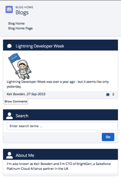
In this scenario, on a small device I want each component to span the full width of the device, while on a large device I want the search/about component to appear in a smaller sidebar on the right hand side.

Using the responsive grid, I can keep the same content, but define different column spans based on the device itself. 

<div class="slds-grid slds-wrap">
    <div class="slds-col slds-size--1-of-1 slds-medium-size--3-of-4">
        ...
    </div>
    <div class="slds-col slds-size--1-of-1 slds-medium-size--1-of-4">
        ...
    </div>
</div>

As the grid styles are mobile first, whatever I specify as the default (slds-size—1-of-1) will apply from extra small upwards. My override for medium (slds-slds-medium-size—3-of-4) will apply to that device size and upwards, so covering medium and large devices.

Blog Posts App

Overview

The sample blog post application conforms to the layout shown above - the main content of the page is a list of blog posts and for medium and large devices, their associated comments. There are additional elements to allow searching for posts containing matching text and about me content. On medium and large devices the additional elements are displayed to the right of the posts, while for extra small and small devices they are stacked under the main content. The Picturefill plugin displays different images for large, medium and small or less devices.

Here’s a screen shot for a large device:

Screen Shot 2015 10 04 at 13 36 54


a medium device (the only difference is the image):

Screen Shot 2015 10 04 at 13 37 19


and finally a small device - the difference here is the image, hidden comments and the right hand content stacked under the blog post body:

Screen Shot 2015 10 04 at 13 37 41

In order to view the sample you’ll need to deploy the code or install the managed package, as I haven’t yet found a way to make lightning components available via a Force.com site. I have hopes that the new lightning components in Visualforce functionality in the Winter 16 release will be the solution to this, but I haven’t had time to play with this in a site context.

This sample was originally written for a Dreamforce talk using Visualforce and Twitter Bootstrap - you can find out more about this in my developerforce blog post.

Gotchas

One thing that I’ve been struggling with and been unable to find a solution to, is conditionally hiding some content for multiple device sizes. When my blog posts are displayed on extra small or small devices, I want to hide the comments and provide a button to allow the user to display them. In something like Bootstrap I’d specify the button container with the classes hidden-md and hidden-lg. LDS doesn’t have an equivalent of this, so I’ve ended up using a span with a single LDS class - slds-x-small-show (which due to mobile-first means hidden for everything) and then adding another container inside this to hide the content for medium devices:

<span class="slds-x-small-show">
    <div class="medium-hide">
        ... button markup here ...
    </div>
</span>

The medium-hide style is as follows: 

/* hide medium and above */
@media all and (min-width: 768px) {
	.THIS .medium-hide {
        display:none;
	}
}


Responsive images also proved a challenge. I use the Picturefill polypill as the HTML5 picture element support is still lacking on some browsers. The latest version of this makes use of the Picture element but the developer console won’t let me save the a component with that markup. For now I’m sticking with version 1 of Picturefill which uses spans. I might take another look at this in the future, as I should be able to add the picture element via JavaScript as part of the initialisation.

When I started writing the code for this blog post, the version of the Lightning Design System was 0.9.1. As I already had a sample using 0.8 I left that alone so there are two static resources in the repository/unmanaged package. LDS is now on 0.9.2 and may well be higher by the time I finish writing the post!

My Domain Required in Winter 16

Don’t forget that the Winter 16 release requires my domain to be set up in order to use Lightning Components.

Code Repository

The code for this sample is available in my Lighting Design System Samples github repository at : 

https://github.com/keirbowden/BBLDS.

There’s also an unmanaged package that you can install to get all of the samples, through be aware that if you do this then the next time I produce a sample you’ll have to uninstall the managed package which will lose any blog data you’ve created.

Related Posts


Thursday, 10 September 2015

Ride the Lightning with Trailhead

Ride the Lightning with Trailhead

There’s a Badge for that

LightingX, or Lightning Experience, the new Salesforce front end was launched on August 25th 2015 to great fanfare. 

When major new features or products come out there’s a requirement for skilling up existing administrators, developers, consultants and partners, as well as the huge number of users of Salesforce. Previously this has involved watching videos that were more often than not produced for internal Salesforce use or particularly focused on an upcoming event, such as Dreamforce. For Lightning X, Salesforce have chosen to use the incredibly popular training tool that is Trailhead to get everyone up to speed.

There are four new LightningX trails:

  • Admin Trail - Migrating to Lightning Experience
    for admins who will be enabling LightingX on the org they manage
  • Admin Trail - Starting with Lightning Experience
    learn how to administer LightningX
  • Developer Trail - Lightning Experience
    for developers to learn how to build apps for LightningX using Lightning Components or Visualforce
  • Sales Rep Trail - Using Lightning Experience
    for users starting with LightningX

These trails are proving hugely popular - at the Q&A with Parker Harris on August 26th 2015, one fact bomb that was dropped was that a LightningX badge was being earned every 15 seconds, which is pretty impressive.

Now obviously I’ve done all of the trails, as I can’t help myself when new badges come online. but as a career developer the developer trail was the most interesting and the one I’m going to look at in a little more detail.

Developer Trail - Lightning Experience

Screen Shot 2015 09 10 at 14 19 16

This is one of the longer trails - with suggested timing of 10 hours 35 minutes its not something you’ll be able to knock out over a lunch hour, but is a better candidate for a quiet Saturday or Sunday in the run up to Dreamforce. Don’t be put off by a longer time - that means that you’ll be learning chapter and verse rather than just skimming the surface, which is exactly what you need if you are going to be selling clients on the benefits of LightningX. It also doesn’t matter if you are looking to continue developing in Visualforce or moving on to Lightning components, as both of these are supported by LightningX and covered in depth in the trail.

The trail not only takes you through the technology, but also provides guidance as to whether you should be jumping in to develop with LightningX or if you should be holding off until things are a little more mature - crucial for those organisations that are debating if they should switch to the new UI. There are also steps for ISV partners and changes to existing development tools, so really something for everyone.

As well as Lightning Components and Visualforce, the trail also introduces the Lightning Design System (LDS) - kind of  a huge deal for those of us that have been trying to build apps that look like Salesforce without trying ourselves into scraped CSS files and the like. Once you’ve earned the badge you can get hands on with the LDS through my blog post on Lightning Design System - Edit Parent and Child Records

There are 5 badges available for this trail, and we all know that Badgier = Better, which brings me on to ...

Badgier - A Perfectly Cromulent Word

In the last blog post that I wrote on Trailhead, I used the word ‘badgier’, which generated more than a little interest online. I’ve been racking my brains to come up with another, equally cromulent, word to embiggen this post.

One of my favourite German words is ‘schadenfreude', often translated as ‘shameful pride’, which is taking pleasure in the misfortunes of others. Based on this I am coining the term ‘badgenfreude’, aka badge pride, which means taking rightful pleasure in your hard earned Trailhead badges. So give yourself a well-deserved dose of badgenfreude and get your LightningX badges with minimal delay.

Related Posts


Sunday, 6 September 2015

Lightning Design System - Edit Parent and Child Records

Lightning Design System - Edit Parent and Child Records

Screen Shot 2015 09 06 at 08 39 55

Introduction

Salesforce introduced the Lightning Design System as part of the new Lightning Experience UX at the end of August 2015. The Salesforce Lightning Design System (SLDS) is the first time that Salesforce have provided the developer community with the CSS, fonts and icons to allow us to build UI components that match the LightningX look and feel. This means no more fragile solutions that pull in the standard stylesheets or wholesale cloning of the standard stylesheets into static resources. In my case it also likely means the end of using Bootstrap for Salesforce1 applications, although as LDS is currently only at version 0.8 I’ll probably give it a few more versions before I move over completely.

After a browsing the docs I was keen to give the SLDS a spin and decided to combine this with another idea I’ve been toying with - taking some of my Visualforce solutions that I’ve blogged about and rebasing those onto Lightning components. So the first sample I’m going with is editing parent and child records on a single screen.

You can find the original Visualforce-centric post here - I haven’t gone for feature-parity with that post, specifically around creating and deleting child records, as there is enough to cover without that, although I may add that in a later version. As always, I’ve gone with the Account sobject as the parent and Contact as the children.

Getting Started with the SLDS

Screen Shot 2015 09 06 at 08 17 00

If you haven’t looked at the SLDS yet, the best place to start (as with so many things Salesforce) is by getting your Trailhead badge for the Lightning Design System module.

Designing the Screen

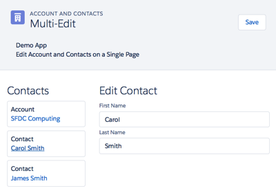
When working with Lightning Components I find its useful to sketch out the layout before starting the development - the greater the degree of granularity, the more reuse you are likely to get. This was made much easier in this case as I decided to use the LDS Master Detail Layout, consisting of the following components:

  • A page header
  • A list of cards for the account and contact records
  • A central form area to allow editing of the selected account or contact record

Here’s a screenshot of the completed page:

Screen Shot 2015 09 05 at 14 19 46

Once I had the basic layout I could start building the various components. I decided to go with a Lightning Application to host the page, as it meant I could navigate to it directly via a URL rather than having to build a navigation mechanism, which is a blog post all to itself!

Implementing the Application

There are quite a few elements to this solution, so I don’t intend to go through the code for all of them. The following sections detail some of the areas that I think are interesting - your mileage may vary - if there’s anything that I haven’t explained that you’d like to know more about, let me know in the comments and I’ll do my best to oblige. You can access the full codebase via the link to the Github repository at the end of this post.

The Application

The key part of the app markup is shown below:

<div class="slds">
    <c:BBAppHeader appEvent="{!c.appEvent}"/>
    <div class="slds-grid slds-wrap slds-p-top--x-small">
        <div class="slds-col slds-size--1-of-3 slds-p-around--medium">
             <c:BBAccountContactList account="{!v.account}"
                                     contacts="{!v.contacts}"
			             selectedContact="{!v.selectedContact}"
                                     editingContact="{!v.editingContact}" />
        </div>
        <aura:if isTrue="{!v.editingContact}">
            <div class="slds-col slds-size--2-of-3 slds-p-around--medium">
                <c:BBContactEditForm contact="{!v.selectedContact}" />
            </div>
        </aura:if>
        <aura:if isTrue="{! (!v.editingContact)}">
            <div class="slds-col slds-size--2-of-3 slds-p-around--medium">
                <c:BBAccountEditForm account="{!v.account}" />
            </div>
        </aura:if>
    </div>
</div>

The markup is wrapped in a div with the class ‘slds’ as the LDS is namespaced - so any styles that I use need to be inside an ancestor with this class or they will revert back to very ordinary looking HTML. 

The left and right components, are rendered inside an LDS grid, as I want to fix the size of each of them relative to each other.

The left hand component, the list of account and contact cards, takes up 1/3 of the available space, so is wrapped in a  div with the class “slds-size—1-of-3’ indicating that this div takes up one column out of a total of three available in the grid. The component takes an ‘editingContact’ attribute, which is set to true when the user clicks on a contact card and false when the user clicks on the account card.

The right hand component is wrapped inside a div with the class ‘slds-size—2-of-3’ indicating that it should take up two of the available three columns, or 2/3 of the available space. Depending on the value of the ‘editingContact’ attribute a form is rendered to allow the account or selected contact to be edited.  Note that I’ve enclosed each from in its own aura:if component - while I could use the ‘else’ attribute, I find it more readable to draw out the conditional rendering in this way. Note also that I’ve repeated the containing div for each conditionally rendered component - I could put this outside the aura:if components, but I’ve gone this route so that if I need to I can apply different styling to the containing div based on whether the user is editing the account or a contact, although at present the styling is identical. Note that I’ve also added a style class of ‘slds-p-around—medium’ to add some padding to the left and right components, otherwise they will butt up hard against each other.

URL Parameters

The id of the account to edit is picked up from the URL - I couldn’t find a mechanism for this that is provided by the Lightning framework, so I’m pulling it via a JavaScript method in the application's helper:

getURLParameter : function(param) {
	var result=decodeURIComponent((new RegExp('[?|&]' + param + '=' + '([^&;]+?)(&|#|;|$)').exec(location.search)||[,""])[1].replace(/\+/g, '%20'))||null;
        return result;
}

The application helper then retrieves the account and contacts for the ID via a server side request:

var action = cmp.get("c.GetAccountAndContacts");
var params={"accountIdStr":accountId};
action.setParams(params);
        
var self = this;
action.setCallback(this, function(response) {
    try {
        self.actionResponseHandler(response, cmp, self, self.gotAccount);
    }
    catch (e) {
        alert('Exception ' + e);
    }
});
$A.enqueueAction(action);

Note that I delegate the handling of the response from the server to a generic method - actionResponseHandler, which takes a parameter of the method that will actually handle the response - self.gotAccount in this case. This allows me to decouple all of the error handling around the request itself from the code that will process the response and update the data model. Note also that I pass the component itself, and the ‘self’ instance of the helper to the response handler - these are in turn passed to the gotAccount method so that when processing the response I can access attributes from the component or helper methods if I need to.

Component Event

The app header component takes an attribute of ‘appEvent’ that specifies a handler for a component event that is fired when the ‘Save' button in the header is clicked. As I plan to re-use the app header in the future, I don’t want to tie it to the expected behaviour of the page. Instead when the user clicks a button, an event is fired indicating the button that was clicked, which allows the containing application to decide what action to take. 

The app header declares the type of event that it will fire, and the name of the attribute that will contain the handler:

<aura:registerEvent name="appEvent" type="c:BBAppEvent" />

The ‘Save' button specifies an onclick handler:

<button class="slds-button slds-button--neutral" onclick="{!c.fireSaveEvent}">Save</button>

The handler constructs the event, specifies which button the user clicked and fires the event:

var appEvent = cmp.getEvent("appEvent");
appEvent.setParams({"action" : "save"});
appEvent.fire();

The containing app receives the event through its declared handler and saves the records to the server: 

appEvent : function(cmp, ev) {
    var action=ev.getParam("action");
    if (action=="save") {
        this.save(cmp);
    }
}

Two Way Attribute Binding

Aside from the event fired from the header component, two-way binding is used to “communicate’ updates between the various components. Using this mechanism means that any updates made to an account or contact in the editing form are also reflected in the account/contact list component, as references to the records are passed through the attribute binding. This means that the same variable instance is used in each component, so a change in one component is automatically picked up by any other component using that variable instance without any additional intervention on the part of my JavaScript.

SLDS Markup

If you aren’t used to CSS frameworks, SLDS can look like it introduces a lot of markup for containing divs etc and a lot of style classes, for example here’s a snippet from the app header:

<div class="slds-page-header">
    <div class="slds-grid">
        <div class="slds-col slds-has-flexi-truncate">
            <div class="slds-media">
                <div class="slds-media__figure">
                    <span class="slds-icon__container slds-icon-standard-account">
                        <c:BBsvg class="slds-icon" xlinkHref="/resource/BB_SLDS080/assets/icons/standard-sprite/svg/symbols.svg#account" />
                        <span class="slds-assistive-text">Account Icon</span>
                    </span>
                </div>
                ...
            </div>
        </div>
    </div>
</div>

All I can say here is that it becomes less jarring over time, as anyone who has spent time working with the Bootstrap framework can attest. One thing it does encourage you to do is to decompose your components as much as possible, to keep the amount of markup short and readable.

Github Repository

Related Posts


Monday, 31 August 2015

Dreamforce 15

Badge2

Brace Yourselves - Dreamforce is Coming

Dreamforce 15 is now just over two weeks away (or has already taken place if you are reading this after September 18th 2015).

A Different Experience #1

This year Dreamforce will be a rather different experience - my company, BrightGen, has a booth (#45) in the Customer Success Zone where we’ll be showcasing our BrightMedia appcelerator for Media Ad Sales. This is the first time since 2010 that I’ve had to man a stand at Dreamforce, which means that I can’t hang out in the Dev Zone as much as I usually would.

A Different Experience #2

I’m speaking, but not in the Dev Zone. Instead I’m giving a more business focused talk on how we are using Lightning Components in the BrightMedia mobile front end - Mobilize Your Media Ad Sales with Lightning Components. This is a 9am start on Wednesday 16th and takes place in the San Francisco Marriott Marquis Hotel, Foothill E. While this is a business focused talk, I’ll be able happy to go into detail on the technical side either after the talk or at the booth. Hopefully I’ll see a few of my regular readers there.

A Different Experience #3

The Dev Zone this year is getting a hefty dose of Trailhead. I’ve had a hand in a Quick Start or two which will hopefully make the cut, so if you are working through those see if you can spot any written in my inimitable style. 

Some Things Don’t Change

The Developer Keynote starts at 10:30 on Thursday 17th in Moscone Centre West and there’s no way I’d miss it, so I’ll be leaving the booth to the tender mercies of the Sales team for the duration. I can’t wait to hear the announcements, although they’ll have to go some to top the performance of Trailhead from last year.


Sunday, 23 August 2015

Certified Salesforce Platform Developer

Certified Salesforce Platform Developer

Screen Shot 2015 08 23 at 16 04 36

(As always with Certification blog posts, please don’t ask for answers or post actual questions in comments etc. Doing so breaches the test taker agreement and devalues the exam for everyone)

Introduction

As a Certified Salesforce Advanced Developer, I was offered the chance to participate in the Platform Developer II Certification in July 2015. Anyone who knows me knows I can’t resist a cert, so I jumped at the chance. 

As is the case for every beta I’ve taken part in, the beta is double the length of the regular exam both in terms of questions (120) and duration (4 hours). The basic premise is that you get more time so that you can give feedback on every question, although the fact that there are twice as many questions means that you have to be keep a close eye on the clock. Personally I take the view that its only worth providing feedback for questions that stand out, for both positive and negative reasons - saying that a question is fine doesn’t really add much or help the certification team.

Preparation

The Study Guides from the Salesforce Certification site give chapter and verse on what you need to skill up on for the exam. I focused on the Visualforce, Apex and Lightning Developer’s Guides, plus a refresher on the latest versions of the metadata and SOAP API. I made sure that I knew the order of execution like the back of my hand and the usual Apex best practice suspects of bulkification, the various aspects of unit tests and asynchronous mechanisms. I also paid special attention to oauth and the mobile SDK. 

The Exam

As always, the exam is proctored, either in person on on-line - I chose the on-line variant as I prefer to do exams from home. For the first time, I had the proctor interrupt the exam to ask me to reposition my camera, which took a few attempts and consumed some time, taking me past the four hours in the end.

What struck me about this exam compared to the original Advanced Developer certification was that it felt like I was reading  less code and evaluating more scenarios based on descriptions. That said, I wouldn’t read too much into this as it could be that the questions I received in the original exam were not overly representative but just happened to skew towards code.

Four hours is a long time to maintain focus, and the bonus of a beta exam is that you don’t receive the results immediately. Instead you have to wait a month or so until all the results and feedback have been assessed and collated. Its also difficult to call, as you don’t know which questions will make the final cut, so questions you found easy to get right might not count, whereas those that you struggled with may count against you.

Results

Obviously I passed or I wouldn’t be drawing attention to the experience with this post! As an existing Advanced Developer, passing Platform Developer II also confers Platform Developer I, so my certs count increases by two. Unfortunately, having achieved the new certs means I have to relinquish my Advanced Developer credential, so the net effect is a increase of one, taking me up to 9 x certified. As the number of certs increases its getting harder to catch them all, especially with the new Marketer credentials.

Final Thoughts

Four hours and 120 questions requires a considerable amount of effort, and wonder how useful the final hour or so actually is to the Salesforce Certification team, both in terms of the feedback (most questions will feel tough by then, due to fatigue if nothing else) and performance (I’d expect more incorrect answers towards the end, again due to fatigue). A better way to run these betas might be to break them up into two exams of two hours/60 questions. Beta candidates would still be required to answer all 120 questions, but not in one solid block. I suggested this as part of my exam feedback, so maybe something will come of this. 

Related Posts

Saturday, 8 August 2015

Trailhead - Bigger, Better, Badgier

Trailhead - Bigger, Better, Badgier

Screen Shot 2015 08 08 at 08 06 29

Introduction

Trailhead has received a major injection of new content in the run up to Dreamforce, and now boasts 30 projects, 7 trails and 6 projects.

If you haven’t used Trailhead yet (Seriously? What have you been doing with your free time?), take a look at my intro blog post to cover the basics.

New Trails

A number of trails have received additional content, but there are also two brand new trails to get tackle:

  • Admin Trail - CRM
    Up until now the trails tended to be focused on customisation or development of the platform side of Salesforce, but that’s no longer the case. This trail introduces the concepts of Accounts, Contacts, Leads and Opportunities, and takes you through configuring sobjects, creating records, setting up a sales process and assigning and converting leads. These are all key skills for administering a Sales Cloud implementation, so if you are thinking of taking your career in that direction its an excellent starting point
  • Dreamforce Trail
    A short trail, comprised of a single module with 3 steps. If you are going to Dreamforce for the first time this year, get the heads up on the general experience and specifics for admins and developers. I’ll be there again this year, but in a change of pace I’ll be manning a stand in the customer success zone so I won’t be able to spend the whole week in the dev zone as I usually do.

New Badges

There are 5 new badges available - 4 across the two new trails covered above, and one for the new Event Monitoring module.

Event Monitoring

Screen Shot 2015 08 08 at 08 11 00


This is a new module on the Intermediate Developer Trail, this is an example of why you should check back with Trailhead regularly - just because you completed a trail a couple of months ago doesn’t mean that’s still the case!

The Event Monitoring module is a shining example of another Trailhead benefit - it gets you working on aspects of the platform you might otherwise miss out on. The event log is something I’ve read about and answered questions on when maintaining certifications, but its not something that I’ve had reason to use up to now. This module not only gets into the details, but also has you working with the event log in your developer edition via the workbench.

Quick Starts and Projects

These aren’t new, but are something that I’ve only just picked up on. The quick starts are ideal if you want to get a rapid, hands on introduction to a particular area of the platform but you only have half an hour or so to spare. The projects require a more significant investment of time, and consist of a number of modules that layer on each other to build a full blown application.

Don’t Delay

There’s a lot of content on Trailhead already. and its only going to get bigger (and badgier!), so the sooner you get started the sooner you’ll have a plethora of badges to brag about on your social media channel of choice.

Screen Shot 2015 08 08 at 08 26 03

Related Posts