| Tweet |
Putting Your TBODY on the Line

Introduction
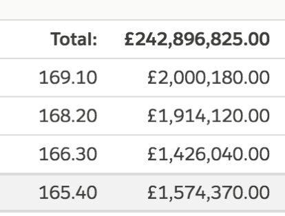
This week I’ve been working on a somewhat complex page built up from a number of Lightning components. One of the areas of the page is a table showing the paginated results of a query, with various sorting options available from the headings, and a couple of summary rows at the bottom of the page. The screenshot below shows the last few rows, the summary info and the pagination buttons.

The markup for this is of the following format:
<table>
  <thead>
    <tr>
      <aura:iteration ...>
        <th> _head_ </th>
      </aura:iteration ...>
    <tr>
  </thead>
  <tbody>
    <tr>
      <aura:iteration ...>
        <td> _data_ </td>
      </aura:iteration ...>
    </tr>
     ...
    <tr>
      <td>_summary_</td>
      <td>_summary_</td>
    </tr>
    <tr>
      <td>_summary_</td>
      <td>_summary_</td>
    </tr>
  </tbody>
</table>
So pretty much a standard HTML table with a couple of aura:iteration components to output the headings and rows. Obviously there’s a lot more to it than this, and styling etc, but for the purposes of this post those are the key details.
The Problem
Once I’d implemented the column sorting (and remembered that you need to return a value from an inline sort function, otherwise it’s deemed to mean that all the elements are equal to each other!), I was testing by mashing the column sort buttons and after a few sorts something odd happened:

The values inserted by the aura:iteration were sandwiched in between the two summary rows that should appear at the bottom. I refreshed the page and tried again and this time it got a little worse:

This time the aura:iteration values appeared below both summary rows. I tested this on Chrome and Firefox and the behaviour was the same for both browsers.
The Workaround
I’ve hit a few issues around aura:iteration in the past, although usually it’s been the body of that components rather than the surround ones, and I recalled that often the issue could be solved by separating the standard Lightning components with regular HTML. I could go with <tfoot>, but according to the docs this indicates that if the table is printed the summary rows should appear at the end of each page, which didn’t seem quite right.
I already had a <tbody>, but looking at the docs a table can have multiple <tbody> tags, to logically separate content, so another one of these sounded exactly what I wanted. Moving the summary rows into their own “section” as follows:
<table>
  <thead>
    <tr>
      <aura:iteration ...>
        <th> _head_ </th>
      </aura:iteration ...>
    <tr>
  </thead>
  <tbody>
    <tr>
      <aura:iteration ...>
        <td> _data_ </td>
      </aura:iteration ...>
    </tr>
     ...
  </tbody>
  <tbody>
    <tr>
      <td>_summary_</td>
      <td>_summary_</td>
    </tr>
    <tr>
      <td>_summary_</td>
      <td>_summary_</td>
    </tr>
  </tbody>
</table>
worked a treat. Regardless of how much I bounced around and clicked the headings, the summary rows remained at the bottom of the table as they were supposed to.
I haven’t been able to reproduce this with a small example component - it doesn’t appear to be related to the size of the list backing the table as I’ve tried a simple variant with several thousand members and the summary rows stick resolutely to the bottom fo the table. Given that I have a workaround I’m not sure how much time I’ll invest in digging deeper, but if I do find anything you’ll read about it here.
No comments:
Post a Comment