| Tweet |
Responsive Design with the Lightning Design System
Introduction
The Lightning Design System was launched by Salesforce in August 2015 and, as I previously blogged, is the first time that Salesforce have made styles available to the developer community that allow us to build pages that match the standard look and feel perfectly (the standard look and feel for the Lightning Experience that is, Salesforce classic would still require style scraping).
The Lightning Design System offers more than just styling - it also provides a Responsive Grid to allow building of user interfaces that react to the device being used, to provide an appropriate experience tailored to the amount of screen real estate available.
Responsive Design
Overview
Wikipedia has a great definition of Responsive Design:
"Provide an optimal viewing experience – easy reading and navigation with a minimum of resizing, panning and scrolling – across a wide range of devices”.
From a technical perspective its a mechanism for building web pages so that they respond to the device that is displaying them. The page changes its content and layout based on the viewport size and orientation of the device. Ethan Marcotte first coined the phrase in his article on A List Apart, which is well worth a read.
An important point about responsive design is that its not about removing content for smaller devices - more and more of the web is accessed via mobile devices these days and you don’t want to punish people for accessing your content via a phone by only serving them part of what you have to offer.
Responsive Grid
A responsive grid breaks your page up into a collection of rows, each of which decomposes into a common number of columns. On a large device the row will contain all columns, while on an extra-small device such as a phone, the grid can reflow to display one column per row, stacking the columns vertically instead of laying them out horizontally.
This is achieved via CSS media queries - a media query is essentially CSS that limits its scope based on attributes of the device. For example, consider the following media query:
.sidebar {
    display: none;
}

@media (min-width: 1024px)  {
    .sidebar {
         display: block;
    }
}
the initial CSS rule mandates that anything with a class of sidebar will be hidden by setting the display attribute to none. The next rule is constrained by a media query and only applies if the minimum width of the device is 1024 pixels. This rule overrides the sidebar style to make it visible by setting the display attribute to block. Thus any user accessing the page on a small device will not see content with the sidebar class, while those accessing from a large device will.
Note that in keeping with the principle that responsive design is not about removing content, if i were using this media query on a real page I would still allow users accessing from a mobile device to see the content, just not as part of a sidebar.
Responsive Images
Displaying the right images for a device form factor is an important part of responsive design, and I’ve written about this before in the following blog post.
Lightning Design System
The Lightning Design System responsive grid is created by specifying a component with the style class slds-grid - I pretty much always use a div as that way I don’t get any additional behaviour outside of the container. Note that you also want to specify the style class slds-wrap, otherwise your grid will continue to layout columns horizontally and, if you are anything like me, you’ll waste a couple of hours digging through the HTML and CSS trying to figure out what is going on.
Inside the grid, elements with the style class slds-col define the column data. Additional style classes can be applied to dictate how the columns will flow based on the device size. For example, given the following layout for extra small and large devices:
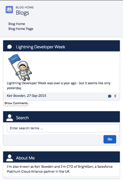
In this scenario, on a small device I want each component to span the full width of the device, while on a large device I want the search/about component to appear in a smaller sidebar on the right hand side.
Using the responsive grid, I can keep the same content, but define different column spans based on the device itself.
<div class="slds-grid slds-wrap">
    <div class="slds-col slds-size--1-of-1 slds-medium-size--3-of-4">
        ...
    </div>
    <div class="slds-col slds-size--1-of-1 slds-medium-size--1-of-4">
        ...
    </div>
</div>
As the grid styles are mobile first, whatever I specify as the default (slds-size—1-of-1) will apply from extra small upwards. My override for medium (slds-slds-medium-size—3-of-4) will apply to that device size and upwards, so covering medium and large devices.
Blog Posts App
Overview
The sample blog post application conforms to the layout shown above - the main content of the page is a list of blog posts and for medium and large devices, their associated comments. There are additional elements to allow searching for posts containing matching text and about me content. On medium and large devices the additional elements are displayed to the right of the posts, while for extra small and small devices they are stacked under the main content. The Picturefill plugin displays different images for large, medium and small or less devices.
Here’s a screen shot for a large device:
a medium device (the only difference is the image):
and finally a small device - the difference here is the image, hidden comments and the right hand content stacked under the blog post body:
In order to view the sample you’ll need to deploy the code or install the managed package, as I haven’t yet found a way to make lightning components available via a Force.com site. I have hopes that the new lightning components in Visualforce functionality in the Winter 16 release will be the solution to this, but I haven’t had time to play with this in a site context.
This sample was originally written for a Dreamforce talk using Visualforce and Twitter Bootstrap - you can find out more about this in my developerforce blog post.
Gotchas
One thing that I’ve been struggling with and been unable to find a solution to, is conditionally hiding some content for multiple device sizes. When my blog posts are displayed on extra small or small devices, I want to hide the comments and provide a button to allow the user to display them. In something like Bootstrap I’d specify the button container with the classes hidden-md and hidden-lg. LDS doesn’t have an equivalent of this, so I’ve ended up using a span with a single LDS class - slds-x-small-show (which due to mobile-first means hidden for everything) and then adding another container inside this to hide the content for medium devices:
<span class="slds-x-small-show">
    <div class="medium-hide">
        ... button markup here ...
    </div>
</span>
The medium-hide style is as follows:
/* hide medium and above */
@media all and (min-width: 768px) {
	.THIS .medium-hide {
        display:none;
	}
}
Responsive images also proved a challenge. I use the Picturefill polypill as the HTML5 picture element support is still lacking on some browsers. The latest version of this makes use of the Picture element but the developer console won’t let me save the a component with that markup. For now I’m sticking with version 1 of Picturefill which uses spans. I might take another look at this in the future, as I should be able to add the picture element via JavaScript as part of the initialisation.
When I started writing the code for this blog post, the version of the Lightning Design System was 0.9.1. As I already had a sample using 0.8 I left that alone so there are two static resources in the repository/unmanaged package. LDS is now on 0.9.2 and may well be higher by the time I finish writing the post!
My Domain Required in Winter 16
Don’t forget that the Winter 16 release requires my domain to be set up in order to use Lightning Components.
Code Repository
The code for this sample is available in my Lighting Design System Samples github repository at :
https://github.com/keirbowden/BBLDS.
There’s also an unmanaged package that you can install to get all of the samples, through be aware that if you do this then the next time I produce a sample you’ll have to uninstall the managed package which will lose any blog data you’ve created.


Hi Keir,
ReplyDeleteI just spend the last 3h using BBLDS to track down a rerender issue when referencing my JHsvg component. My component was exactly the same as yours including version, component, render, and svg. Yours worked and mine did not. I tried to trace into the LD re-render javascript to understand the problem with no luck. I recreated my component using Developer Console and it worked. I recreated it again (as I did the first time) with MavensMate and it failed again, e.g. reproduced. The error says 'markup://aura.html (value || ""). replace is not a function. I don't have the time to investigate the root cause but I thought to stop and share the finding in case anyone else might benefit.
I don't think I would have found it unless I had a working svg component to compare and contrast with. Thank You!
Regards,
jason
This comment has been removed by a blog administrator.
ReplyDeleteInformative post,this article is more useful for web designers,i tried with the coding its working good.thanks.
ReplyDeletethis means we will always have to override the global navigation in order to have it responsive as well?
ReplyDeletethis means we will always have to override the global navigation in order to have it responsive as well?
ReplyDeleteDid you ever go down this path. (the above article is great for page content but how does one translate something like this to a mobile view? SLDS says it's mobile first but I don't see how that is the case with this component. https://www.lightningdesignsystem.com/components/global-navigation/
Deleteslds-wrap : "if you are anything like me, you’ll waste a couple of hours digging through the HTML and CSS trying to figure out what is going on" - That's me! LOL :) Good writing, thanks!
ReplyDeleteuseful post that we have read and understood it.
ReplyDeleteIt’s a very informative and helpful article, thank you for sharing!
ReplyDeleteIt seems lightning:layoutItem can also be used to create responsive design
ReplyDeletethank u so much. It helped me a lot
ReplyDelete