Saturday, 23 May 2015

Lightning Component Events

Introduction

One of the common challenges in Visualforce involved communication between pages and components, or components and components.  Solutions typically involved passing controller instances as attributes, preferably wrapped up in an interface to avoid directly coupling presentation items to specific Apex classes.  This allowed a component to execute a callback in the related component/page controller, but only in response to a postback, as JavaScript remoting or Rest API is stateless and wouldn’t have access to the controller passed in as an attribute. 

Lightning Application Events

Lightning components simplify this enormously via the application events functionality. This allows components/applications to fire events that are consumed by other components that subscribe to them - publish and subscribe in all its glory.

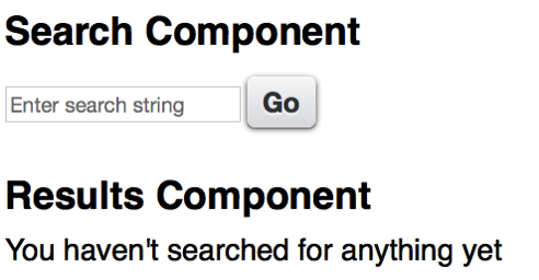
To give a simple and useless example, I have an application that allows a user to enter a search term:

Screen Shot 2015 05 23 at 17 34 39

and when the search term is entered, display an unhelpful message about it;

Screen Shot 2015 05 23 at 17 37 13

The Event

The markup for the event is pretty simple:

<aura:event type="APPLICATION" description="Search Event">
    <aura:attribute name="term" type="String" />
</aura:event>

this event takes a single attribute - the string that has been searched for.

Search Component

The search component declares that it fires the event:

<aura:registerEvent name="SearchEvent" type="bblightning:SearchEvent" />

while the event is constructed and fired from the helper, via a controller method, when the user clicks the search button:

var searchTerm=component.get("v.term");
    $A.get("e.bblightning:SearchEvent").
	 setParams({term: searchTerm}).fire();

“v.term” here refers to a component attribute, which backs the search term input field.

Results Component

The results component declares that it handles the event via the searched controller function:

<aura:handler event="bblightning:SearchEvent" action="{!c.searched}"/>

the searched function simply delegates handling of the event to a helper method, which generates the message to let the user know that their efforts haven’t been in vain:

searched : function(component, event) {
    var searchedTerm=event.getParam("term");
    component.set('v.msg',
                  'You searched for the term [' + searchedTerm +
                  '] - if I had an Apex controller, ' +
                  ' I might find some matching records');
}


Putting It All Together

The actual functionality here is pretty immaterial, hence my being so dismissive of it.  The important aspect is revealed when viewing the application markup:

<aura:application >
    <div class="padded">
	<c:SearchForm />
    	<c:SearchResults />
    </div>
</aura:application>

The first component produces the form, while the second component displays the results. Note that there is nothing wiring the two components together in the markup, so I could just as easily assemble this application using the Lightning App Builder. What isn’t apparent through the markup is that all of this takes place client side and is very fast. Any future components that want to capture the search term, for logging/audit purposes for example, simply need to handle the event and be added to the application.

The full source for this marvellous application, related components and event is available in my Lighting Examples GitHub repository - look for the src/aura/Search* elements.
Related Posts


Wednesday, 6 May 2015

International Day against DRM

2015 Banner

If you’ve ever visited this blog before, you’ll know that I wrote a bestseller called the Visualforce Development Cookbook, and that each page of this blog contains a link to allow a smooth and easy purchase.  If you’ve been holding off adding to your cart waiting for a better price, wait no longer. For today only (6th May 2015) you can have your very own copy for just $10.

That’s right, $10. Packt Publishing are celebrating International Day against DRM by offering all e-books and videos for just $10 for one day only. Here’s the official word:


Packt celebrates International Day Against DRM, May 6th 2015 


Packt Publishing firmly believes that you should be able to read and interact with your content when you want, where you want, and how you want – to that end they have been advocates of DRM-free content since their very first eBook was published  back in 2004. 


This year, to demonstrate their continuing support for Day Against DRM, Packt is offering all its DRM-free content at $10 for 24 hours only on May 6th – with more than 3000 eBooks and 100 Videos available across the publisher’s website www.packtpub.com, there’s plenty to discover, whatever you’re interested in.

“Our top priority at Packt has always been to meet the evolving needs of developers in the most practical way possible, while at the same time protecting the hard work of our authors. DRM-free content continues to be instrumental in making that happen, providing the flexibility and freedom that is essential for an efficient and enhanced learning experience. That’s why we’ve been DRM-free from the beginning – we’ll never put limits on the innovation of our users.” 

– Dave Maclean, CEO


Advocates of Day Against DRM are invited to spread the word and celebrate on May 6th by exploring the full range of DRM-free content at www.packtpub.com - all eBooks and Videos will be $10 for 24 hours, including the latest hot titles.


You can find out more information at: http://bit.ly/1AEPeiW

Sunday, 3 May 2015

Lightning Components and CSS Media Queries


NewImage

Overview

When building Lightning Components, its highly likely that you will be aiming to support multiple form factors - tablets, phones and maybe even desktops.  In order to achieve this, Responsive Web Design techniques need to be employed (for an overview of Responsive Design and an example of achieving this using Visualforce and the Bootstrap framework, see my post in the Salesforce Developers Technical Library). 

When using a framework such as Foundation or Bootstrap, its simply a matter of using the appropriate Lightning component, as described my earlier post on Lightning Components and JavaScript Libraries. Keeping the styling with the component presents a little more of a challenge.

Styling Lightning Components

Styling Lightning components is well documented, and involves adding styles to the component bundle. Here’s an component that renders a case, generating two fields per line through use of CSS floats.

Component:

<aura:component >
    <aura:attribute name="case" type="Case" description="Case to display" />
	<h1>
        <ui:outputText aura:id="caseNum" value="{!v.case.CaseNumber}"/>
    </h1>
	<div class="caseFieldLeft">
        <label>Subject: </label>
        <ui:outputText aura:id="subject" value="{!v.case.Subject}"/>
    </div>
	<div class="caseFieldRight">
        <label>Created: </label>
        <ui:outputDateTime aura:id="created" value="{!v.case.CreatedDate}"/>
    </div>
	<div class="caseFieldLeft">
        <label>Priority: </label>
        <ui:outputText aura:id="priority" value="{!v.case.Priority}"/>
    </div>
	<div class="caseFieldRight">
        <label>Status: </label>
        <ui:outputText aura:id="subject" value="{!v.case.Status}"/>
    </div>
</aura:component>

Style:

.THIS.caseFieldLeft {
    padding: 2px 4px 2px 2px;
    width: 45%;
    float: left;
    clear: both;
}
.THIS.caseFieldRight {
    padding: 2px 4px 2px 2px;
    width: 45%;
    float: right;
}
h1.THIS {
    padding: 4px 2px 4px 2px;
    font-size: 1.5em;
    clear: both;
}

For the sake of completeness, here are gists for the containing Lightning App, JavaScript Controller, JavaScript Helper and Apex Controller.

Using this component to render a list of cases results in the following:

NewImage

which is readable, if not exactly easy on the eye. However, when rendered on a phone sized viewport the experience is not so good:

NewImage

The Subject in particular isn’t really readable, and ideally I’d drop down to a field per line.

Adding Media Queries

Generating a field per line is simply a matter of adding a media query that takes effect for smaller devices - below is an example which does this for devices with a width of 980px or less:

@media all and (max-width: 980px) {
    .caseFieldLeft {
	    padding: 2px 4px 2px 2px;
	    width: 100%;
	    float: none;
	}
	.caseFieldRight {
	    padding: 2px 4px 2px 2px;
	    width: 100%;
	    float: none;
	}
}

As of May 2015 there’s one problem using this - the Style element of the component bundle won’t accept media queries. I’ve tried quite a number of combinations which always end up with the same result - a parse error.

Update 20/08/2015

The media query syntax is now supported in Lightning Component style elements (and may have been since the Summer 15 release I guess - this is the first chance I've had to revisit). Simply use the same style names that aren’t subject to the media query (remembering to include the .THIS to namespace to the component) :

 
@media all and (max-width: 980px) {
.THIS.caseFieldLeft {
padding: 2px 4px 2px 2px;
width: 100%;
float: none;
}
	.THIS.caseFieldRight {
padding: 2px 4px 2px 2px;
width: 100%;
float: none;
	}
}

and now viewing on a small device is an improved, if not enjoyable, experience!

NewImage

Related Posts