At the February Meetup of the London Salesforce Developers Group, I presented a session where I went through some of the things I’ve learned while building Visualforce solutions to run in Salesforce1. The slide deck for this session is available on SlideShare, but some of the slides might be difficult to understand without the words that went with them, so in a departure from my usual blogging style I’ve decided to pick out some slides from the deck and explain what I was trying to show.
Capturing Input
The <apex:inputField /> component is not supported in Salesforce1if it creates a widget - e.g. date picker (although this component seems to work a lot of the time in iOS but not android). Rather than trying to implement your own version of a Visualforce input, its better to use the HTML5 type attribute and let the browser determine the appropriate input mechanism to display. The second slide shows how the the iPhone reacts to type attributes - displaying a date spinner for a date and a custom keyboard including digits for number. Unfortunately there isn’t a type for a lookup to another record, so you’ll still need to roll your own solution to this.
Something many people complain about when using HTML5 or Hybrid mobile applications is that clicking buttons can be unresponsive. Often this is down to the default behaviour of the webkit based browser (so Safari or Chrome at the least), which is to wait 300m/s after a click to see if the user is actually carrying out a double-click. While this makes sense on the desktop, double tapping isn’t that common in mobile applications (although it is sound advice in Zombieland). The way that I typically work around this is to bind to the touchstart/end events rather than the click event. When working in JQuery Mobile this is easy, as the framework adds support for these events. Otherwise, built-in browser support is patchy so you may end up having to use another JavaScript solution such as the Event or Zepto packages.
window.open()
The next block of slides relates to using window.open() to open a child browser window rather than the regular webview - this only works for iOS, but has allowed me to work around a few issues:
Rotating the iPhone application simply results in a sideways view of the page:
whereas rotating a page opened in the child browser works as expected:
List jumping has been acknowledged by Salesforce as a known issue. What happens here is that if you have a clickable list of items that is larger than the viewport, when you scroll down and click an entry, the application jumps back to the top of the list after the click. However, I found this to be worse when using Bootstrap, in that the jump to the top took place before the click had been handled, resulting in the click being applied to the wrong element.
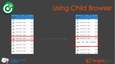
In the slide below, I’ve clicked on the Blog 5 entry to expand, but the app has jumped back to the top and expanded the Blog 11 entry, I originally found this when placing delete buttons on a list, so it wasn’t just an irritant, it was affecting the data:
If I open the list in a child browser though, the item that I click on is the one that expands and the view stays at the correct place:
The next issue that I covered involved Bootstrap responsive tables. The way that Boostrap handles tables is to leave it sized as it is, but wrap it in a scrolling element. This means that when a page containing a responsive table is accessed on a small screen device, the elements outside the table will wrap and the table becomes scrollable:
Accessing this page in the Salesforce1 app, however, and the page is resized to the width of the table, with the text spanning the full width. Even worse, if you have any dialogs in the page, they will be the full width of the page too, which means that you would need to scroll around the page to find the dialog message:
Opening the page inside the child browser respects the fact that the table is scrollable and reflows the text appropriately for the device:
As I’ve blogged before though, the child browser introduces some additional complexity - you can’t tell that you are in the Salesforce one context for a start, and as I mentioned earlier, it isn’t a solution for Android (although the responsive tables do behave correctly on my Nexus 7 so there is slightly less need for it).
The final points I made were around mobile development best practice:
If you are designing applications that will genuinely be used while on the road, with all of the connection and bandwidth issues that brings, you really don’t want to be using much Visualforce at all, instead you should rebuild the app to do most of its work on the device. I presented a session on this topic at Dreamforce that applies equally well to Salesforce1 - you can watch the video here.


This comment has been removed by a blog administrator.
ReplyDeleteIf doesn't work for record lookups, do I need to implement a separate VF page & controller for doing the lookup? Something like you blogged about at http://bobbuzzard.blogspot.com/2010/09/visualforce-lookup.html?
ReplyDeleteFYI - The responsive design tables is still an issue in SF1 with Bootstrap as of Summer 15 so Child Browsers in iOS is still only viable solution for that. I wonder how this will work in Lightning UX going forward? Hopefully SFDC fixes this platform bug.
ReplyDeleteThis comment has been removed by a blog administrator.
ReplyDeleteI recently encountered the list jumping issue on a VF Page viewed within SF1. CSS below fixed the scrolling issue for me.
ReplyDeletehtml, body {
height: 100%;
overflow: auto;
-webkit-overflow-scrolling: touch;
}