Introduction
A typical scenarios where I favour lightning pages over flows is where a user's decisions around field values need to have a major impact on the rest of the elements being displayed, and where a wizard interface would slow the user down too much. A great example of this is our BrightMEDIA order booking page. As the user inputs information about the type of advert, where it needs to appear, what size it is and when it appears, the price is dynamically recalculated and displayed. The user typically has the customer on the phone, and there may be a few cycles of tweaking the details to hit a price point - what happens if we make it a bit smaller, move it to another section etc. Paging back and forward through the wizard wouldn't be a great experience, along with the need to keep saving the order as navigation between pages takes place.
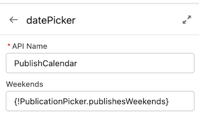
With the Spring 23 release of Salesforce, it looks like in future flow will become a candidate for this kind of user interface with the advent of the Reactive Flow Components beta. Simply put, you can wire the input of one component up to the output of another component, and react when changes occur.
As this is a beta, you'll have to opt-in to it for any org where you want to use reactive components by checking the box in the Automation Settings
The Sample
A lot of the demos around reactive anything tends to be a table of accounts that updates when the user inputs the desired number of entries. That's exactly what I started with to get a handle on how this works, but it's not overly interesting, so I decided to return to our BrightMEDIA accelerator for inspiration.
One of the more complex Lightning Components we have in the order booking page is the data picker. This can render as a drop down or a calendar, with dates available for selection rendered in specific styles depending on whether capacity is available, if they are contiguous with a selected start date, and many other rules.
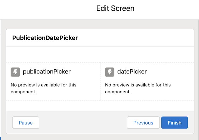
So for my sample I have a couple of custom Lightning Web Components:
- A Publication Picker - this is a simple choice style component, but I've had to go custom as the standard choice component doesn't yet have reactive support. Each publication has a checkbox that indicates if it publishes on weekends as well as weekdays.
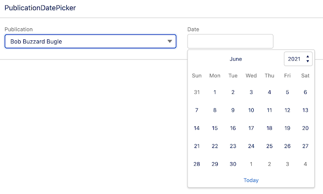
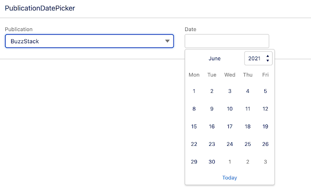
- A Date Picker - this is a calendar component that by default displays a 7 day week, but if the selected Publication doesn't publish on weekends, switches to a 5 day week.


