Introduction
When building applications to run on the Salesforce1 platform across multiple devices, utilising responsive web design techniques is a must. A responsive application adjusts its layout according to the capabilities of the device used to view.
One of the biggest challenges in responsive web design is image handling - how to efficiently display appropriately sized images.
Download and Shrink
A 2012 survey found that 86% of sites delivered the same content regardless of the device. In my opinion one of the main reasons for this is the download and shrink approach to images. In this case, a single large image is embedded inside a block container (such as a <div> element) and styled to take up 100% of the width. As the block container changes size based on the capabilities of the device, the browser will automatically scale the image.
The following page is an example of download and shrink:
<apex:page sidebar="false" showheader="false">
  <style>
    .respImageContainer{
    	width:150px;
    	padding-top:10px;]
    }

	@media ( min-width: 768px ) {
    	.respImageContainer
    	{
    		width:320px;
    	}
	}

	@media ( min-width: 1024px ) {
    	.respImageContainer
    	{
    		width:677px;
    	}
	}
  </style>

  <div class="respImageContainer">
    <img style="width:100%" src="{!$Resource.S1DevWeekLarge}" />
  </div>
</apex:page>
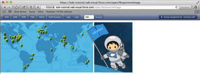
If the device has a minimum width of 1024px, the <div> element containing the image has a width of 677px, which is the actual size of the image:

If the device has a minimum width of 768px, the <div> element containing the image has a width of 320px:

If the device has a minimum width of 320px, the <div> element containing the image has a width of 150px :

The original image is 677 x 259 pixels, 175343 in total. In the final screen shot, the image is resized to 150 x 57 pixels, 8550 in total. This means that most of the image is discarded when displayed, which is extremely inefficient use of bandwidth. There is also another problem here, known as art direction - the map in the image in the final screenshot is really too small to be of any use, so it would be better to zoom in on the spaceman as the Salesforce1 developer week logo.
HTML5 Picture Element
In the fullness of time image handling will be provided by the HTML5 picture element, an example of which is:
<picture>
  <source media="(min-width: 1024px)" src=“large_image”></source>
  <source media="(min-width: 768px)" src=“med_image”></source>
  <source src=“small_image”></source>
  <img src="fallback_image"></img>
</picture>
as can be seen, the <picture> element contains a number of <source> elements, each of which refers to a different image. The <source> element optionally contains a media query which must be satisfied in order for the image to be chosen. In the example code above:
- if the device has a minimum width of 1024px, the large_image file will be used.
- If the device has a minimum width of 768px, the medium_image file will be used.
- Otherwise the small_image file will be used.
Note that the <picture> element also contains a regular HTML <img> element - if the browser doesn’t support the <picture> element, the fallback_image file will be used. The use of the fallback <img> element does present a challenge, as browsers typically try to pre-fetch images before the page has been completely loaded and parsed. This can lead to the situation where the fallback image is downloaded, only to be discarded as the image file identified can be used instead.
Unfortunately browser support is still patchy for the <picture> element; at the time of writing (November 2014) only Chrome and Opera provide support by default.
Picturefill
Picturefill, by Scott Jehl, is a Polyfill for the HTML5 picture element, that uses JavaScript to load the appropriate picture based on additional HTML5 data- elements on <div> or <span> elements:
<apex:page standardStyleSheets="false" showHeader="false">
  <style>
    .respImageContainer {
    	padding-top:10px;
    }
  </style>

  <apex:includeScript value="{!$Resource.PictureFill_1_2}" />
    <div class="respImageContainer">
      <span data-picture="1" data-alt="S1 Dev Week">
        <span data-src="{!$Resource.S1DevWeekSmall}"></span>
        <span data-src="{!$Resource.S1DevWeekMed}"
              data-media="(min-width: 768px)"></span>
        <span data-src="{!$Resource.S1DevWeekLarge}"
              data-media="(min-width: 1024px)"></span>
      </span>
    </div>

    <script>
      window.picturefill();
    </script>
</apex:page>
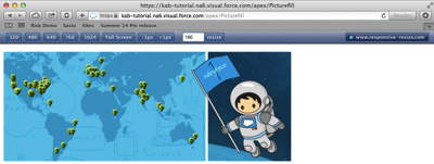
The image source is defined by the data-src attribute, while the media query is present in the data-media attribute. I’ve included the Picturefill JavaScript as a static resource as I couldn’t find it on any of the major content delivery networks. This adds a Picturefill function to the window element which is called to process the page and load any images. This results in appropriately sized images being delivered to each page, at 1024px:

at 768px:

and at 320px an image containing only the spaceman is rendered:

Picturefill has two versions - one that works against <div> elements and one that works against <span> elements. I tend to use the latter as I've found that the <div> elements can interfere with the styling introduced by Bootstrap, which is my responsive framework of choice. The downside to this approach is that it introduces latency when loading images, as the page is rendered before the JavaScript executes, and only then are the images loaded.
Resources


